A polished website can still be the wrong fit for a growing business. The clearest signs your business has outgrown its website include outdated messaging, difficulty reaching the customers you want, a poor mobile experience, and updates or inquiries that are harder than they should be. Several signs together are a reason to consider an upgrade, but the right next step depends on what no longer works.
It’s natural to think a new look will solve the problem, but a redesign works best when it addresses the site’s structure and purpose as well as its visuals. Your website should reflect what your business offers today, guide the right visitors to useful information, and make the next step clear.
This article will help you assess whether your brand and website still fit your business, spot friction in your content and customer journey, and decide whether a focused refresh or a complete redesign makes sense. You’ll also find practical questions to help shape a site that supports your next stage of growth.
Key Takeaways
- Compare your current brand, offerings, and goals with what your website communicates to spot where the message has fallen out of step.
- Review whether your content speaks to the customers you want to reach today and guides them toward a clear next step.
- Identify which DIY limitations are slowing updates, restricting flexibility, or making the site harder to manage as the business grows.
- Separate visual updates from deeper structural needs before deciding whether to refresh existing pages or plan a broader redesign.
- Use visitor behavior, mobile usability, content priorities, and future business needs to shape a practical redesign plan.
Evaluating whether a brand reflects the current business
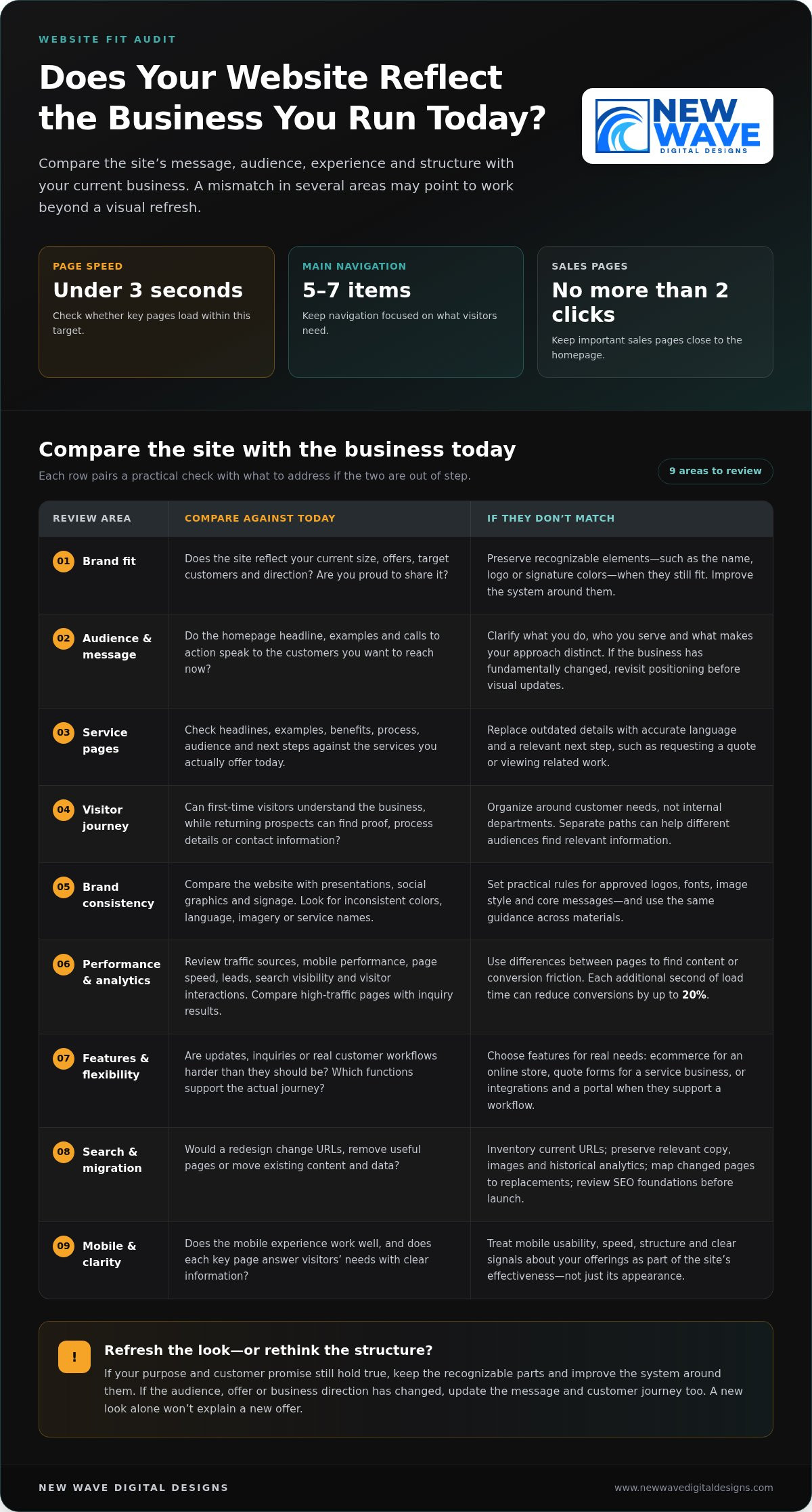
Start by comparing your website with the business you run today. A strong brand helps visitors understand what you do and what sets your business apart. Review your current size, offers, target customers, brand consistency, and whether you’re proud to share the site. A mismatch across several areas can signal that the website no longer reflects your direction.
Growth doesn’t always call for a complete rebrand. If customers still recognize your name, logo, or signature colors, preserve those distinctive elements while improving the system around them. For example, keep a familiar logo but refine its typography, imagery, and use across key pages. Having to repeatedly explain what your company offers now is another sign your business has outgrown its website.
Compare your website with your presentations, social graphics, and signage. When employees or suppliers create assets at different times, colors, language, and imagery can gradually become inconsistent. Set practical brand rules for approved logos, fonts, image style, and core messages. Apply the same guidance when updating pages or creating new materials.
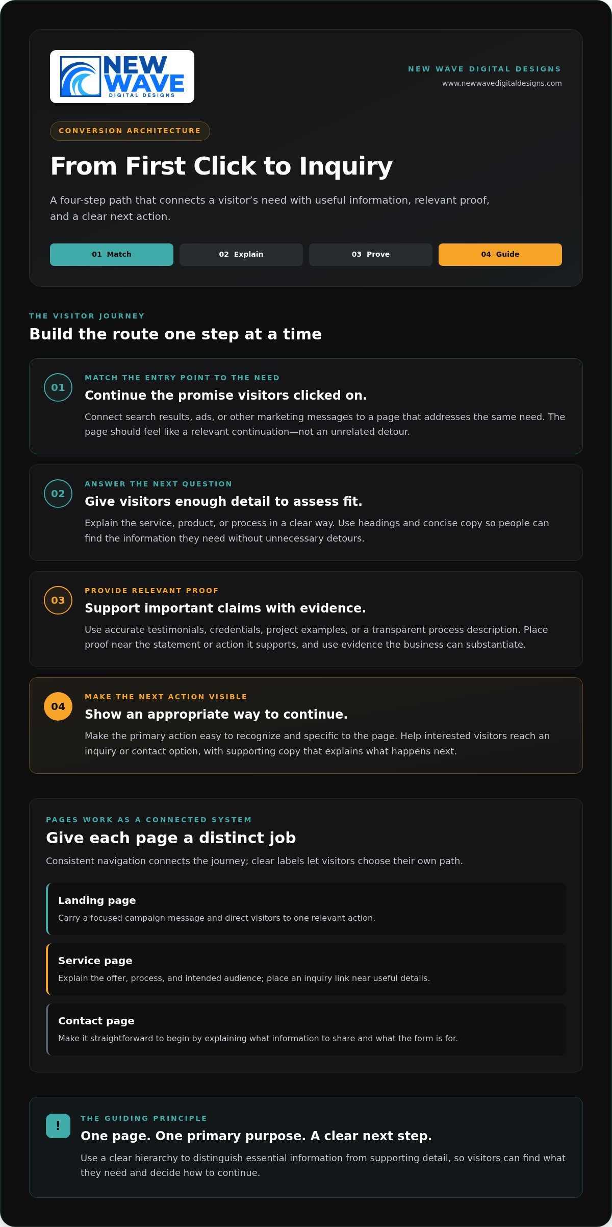
Next, read your homepage and main service pages as a prospective customer. Do they describe your current offers, explain what makes the business distinct, and speak to the customers you want to reach? If the homepage targets an old audience or a service page describes a past offer, update its wording and images. Brand positioning includes these choices, not just visual design.
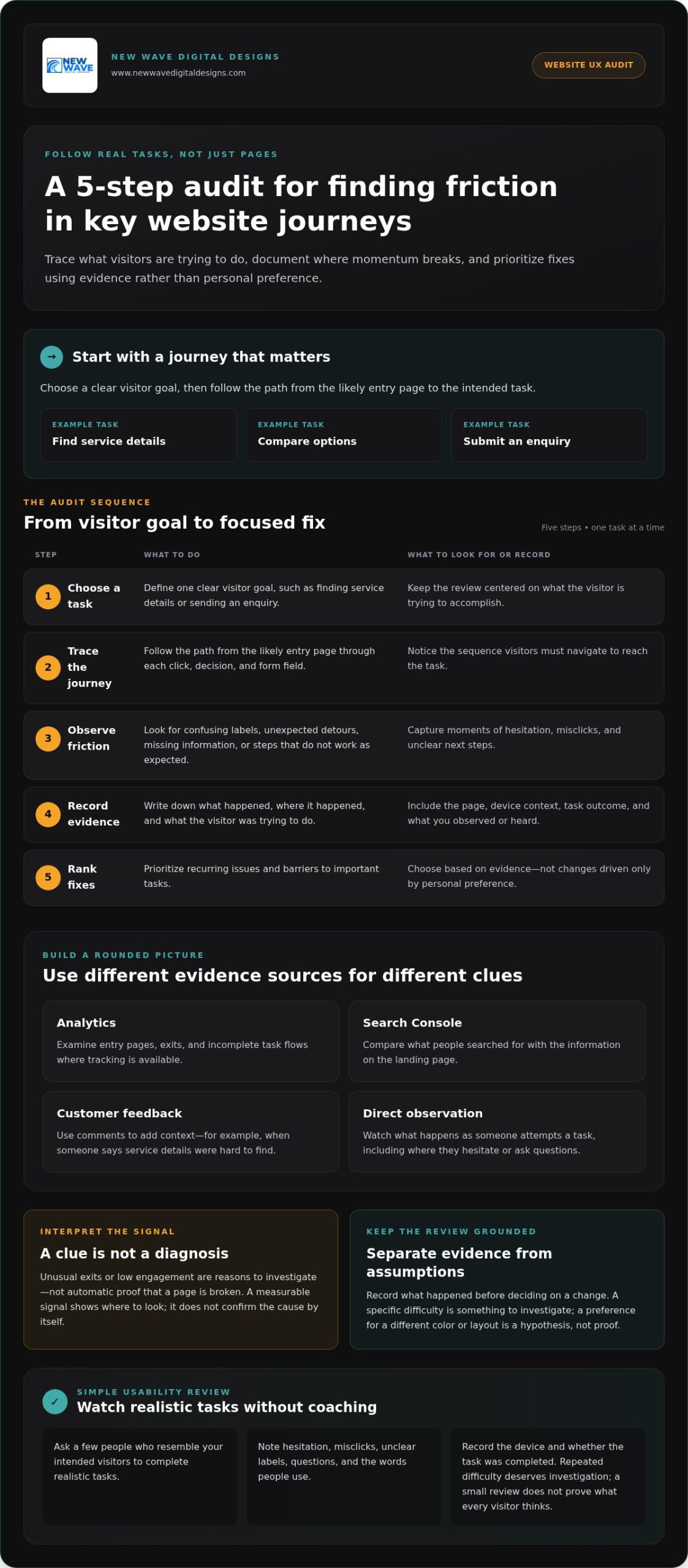
Website analytics can help reveal where the experience falls short. Review traffic sources, mobile performance, page speed, leads, search visibility, and visitor interactions. Compare pages with strong traffic but few inquiries with pages that generate useful actions. The differences can point to content or conversion friction.
Slow pages can frustrate visitors and weaken conversion opportunities; each additional second of load time can reduce conversions by up to 20%. Search engines also prioritize speed, structure, mobile performance, and clear signals about a business’s offerings. Check whether key pages load in under three seconds and whether their content answers visitors’ needs.
Choose features from actual customer journeys, not a generic checklist. An online store may need ecommerce, while a service business may benefit from quote forms; integrations or a customer portal matter when they support a real workflow. Keep navigation focused, with 5-7 main items, and place important sales pages no more than 2 clicks from the homepage.
A redesign also carries practical risks. Changing URLs or removing useful pages can disrupt search traffic, while migrating content without an inventory can leave copy, images, or historical analytics behind. Before launch, document current URLs, preserve relevant content and data, map changed pages to their replacements, and review the redesigned site’s SEO foundations.
2. Changing audiences and outdated positioning
A growing business can outpace the audience its homepage was designed to reach. For example, a company once focused on individual buyers may now serve procurement teams, business owners, and larger organizations. If the homepage still speaks to its original customer, new visitors may struggle to see whether the business fits their needs. Review the headline, examples, and calls to action against the customers you want to reach now.
Positioning can change even when the company name and core expertise remain familiar. A firm that once sold one service may now offer several related solutions or serve a different market with deeper expertise. Check whether the website explains what the business does, who it serves, and what makes its approach distinct. If visitors need a sales call to understand those points, the site’s message may be outdated.
Audit each service page for details that no longer match the actual offer. A page may still appear in search results while describing an outdated process, audience, or scope. Review its headline, examples, benefits, and next step, then compare them with current sales materials. Replace outdated claims with accurate language and guide visitors toward an action suited to the service, such as requesting a quote or viewing relevant work.
Audience changes can also expose structural problems. A site organized around internal departments may force visitors to guess which page answers their questions. Map the customer journey instead: first-time visitors need a clear explanation, while returning prospects may want proof, process details, or a direct route to contact. If your business serves both homeowners and commercial clients, separate paths can help each group find relevant information without creating competing messages.
Decide whether to refresh the existing brand or rethink its positioning by examining what still holds true. If the company’s purpose and customer promise remain sound, preserve recognizable elements such as its logo, name, or signature colors, then build a clearer system around them. If the business has fundamentally changed, revisit the core message before making visual updates. New colors alone can’t explain a new offer.
Consistency matters as the business grows. Create practical guidance for employees and suppliers covering approved logos, typography, photography, and key phrases. For example, use the same service names on the website, proposal, and presentation. A considered brand design approach can help translate updated positioning into a coherent visual language across marketing materials.
3. Moving from a DIY site to a professionally built website
A DIY website can be a practical starting point, especially when a business needs to publish essential information quickly. The strain appears when routine changes become difficult: adding a service page disrupts the layout, updating a form takes repeated effort, or the marketing team can’t publish without outside help. Track which tasks stall, who handles them, and how often they interrupt customer work.
Growth may expose limits in customization and integrations. A builder that supports a simple contact page may not adapt easily when the business needs ecommerce, quote requests, or a connection to customer-management tools. List the functions you need, identify which the current platform supports, and note where manual workarounds remain. Repeatedly copying information between systems, for example, signals workflow friction.
Search optimization can reveal another constraint. Some website builders provide basic SEO tools but limit control over technical details as a site expands. Check whether staff can edit page titles and descriptions, organize URLs, and add useful structured information. If new service pages can’t be optimized consistently with existing ones, the platform may be restricting your search strategy.
Review mobile layouts separately. DIY templates can look polished on desktop while buttons, forms, or page sections become awkward on a phone. Test the same key journey on both screen sizes: open a service page, find the main action, and complete the contact form. If a small desktop edit repeatedly breaks the mobile layout, the design system may be too fragile for your team’s needs.
A professionally built website should make ongoing content work manageable, not create a permanent queue of small changes. A content management system can let owners update text, images, blog posts, and pages without coding. Before choosing a new structure, decide who will update each content type and which reusable page patterns will keep service pages consistent.
Moving platforms also calls for a deliberate transition. Inventory current pages, forms, images, and analytics before rebuilding, then identify what still supports business goals. Map useful old URLs to their new destinations, preserve key copy and records, and test forms before launch. These steps reduce the risk of losing valuable content or sending visitors to broken pages.
Choose the next build around the opportunities your business needs to support. A growing store may prioritize ecommerce, while a service company may need clear quote forms and flexible service pages. Specify required integrations, mobile behavior, editing responsibilities, and search needs in a written brief. That clarity helps the website evolve with the business instead of reproducing the same limits in a new design.
4. Outdated design and competitor comparisons
A website may feel outdated when its layout, imagery, or content no longer fits the business, or when visitors struggle to find information and take the next step. A site built several years ago can look dated as design conventions and business needs evolve. Age alone isn’t proof that you need a rebuild; persistent friction is a stronger signal.
Consider visitors’ first moments on the homepage. They can form an impression quickly, so a cluttered layout, hard-to-read text, or generic imagery can weaken trust before they explore. Check whether the page clearly explains what you offer, who you serve, and what visitors can do next. If those details are buried beneath decorative elements, simplify the visual hierarchy.
Compare your website with a few businesses serving similar audiences, but assess the experience rather than copying their style. Look at how each site presents services, organizes information, and guides visitors toward contact or purchase. Note specific gaps, such as missing project examples or unclear service descriptions. Then choose improvements that express your own strengths and brand, not another company’s visual identity.
Design patterns from more than five years ago may feel dated, but a full rebuild isn’t always necessary. If the structure still supports current needs, updating photography, typography, page layouts, and copy may be enough. If the navigation, mobile experience, or content management repeatedly creates obstacles, a broader redesign may provide a more useful foundation. Many businesses reassess their websites every 3-5 years as technology, design, and business needs change.
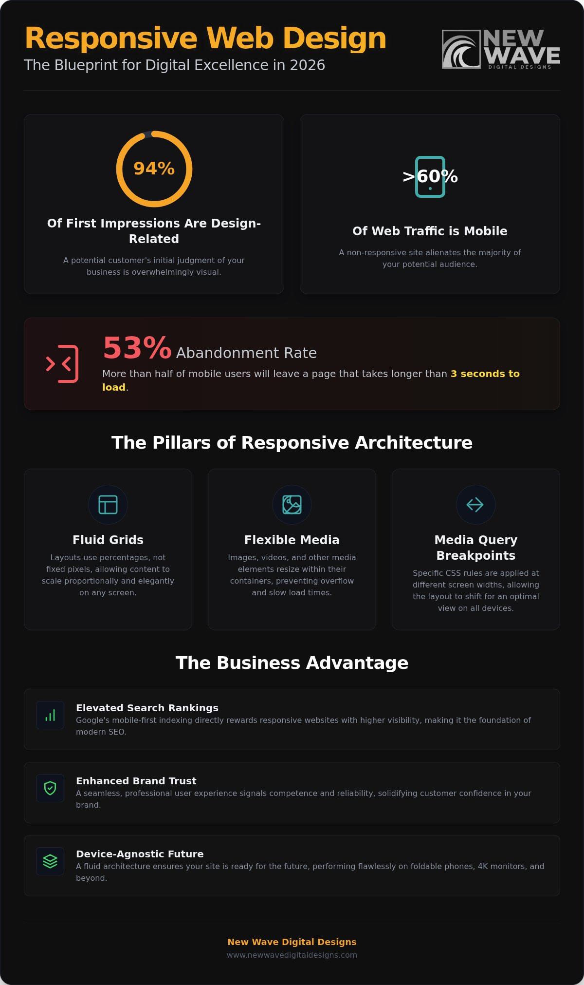
Test the same journey on a phone and desktop. Can visitors read the main message, use the navigation, and reach a contact form without pinching to zoom or struggling with the layout? Google uses mobile performance in ranking sites, so a usable mobile experience matters to both visitors and search visibility. Record awkward steps, then prioritize the pages customers use most.
Website analytics may help you understand which pages attract visitors and where they leave. Compare those observations with customer questions and sales feedback. A high-traffic page without a clear next step may need stronger content or a more visible action. A service page with little engagement may need clearer information, better internal navigation, or a renewed purpose.
Before choosing a rebuild, separate visual symptoms from structural problems. Create a short review with three columns: what works, what confuses visitors, and what the business needs next. For example, retain a recognizable logo, revise a dated homepage, and reorganize service pages only if customers struggle to find them. This evidence-based approach keeps a refresh focused and gives a larger redesign a clear rationale.
Questions to guide a redesign
Start with the business decision your website must support. Are you prioritizing qualified inquiries, online sales, bookings, or stronger support for sales conversations? Choose the primary outcome, then define what a useful visitor action looks like. For a service business, that might be a completed quote request; for a shop, a completed purchase.
Ask whether the current site still serves that goal. A website can look polished yet lose opportunities through unclear calls to action, confusing forms, or pages that attract the wrong audience. Compare visits, engagement, form starts, completed submissions, and sales in your analytics. If visitors reach a sales page but leave before acting, examine its message, proof, and next step.
To see whether a website is hurting conversions or generating too few leads, compare lead and sales activity with relevant traffic, then trace where visitors drop off. Review analytics and conversion tracking by page and source, and inspect the path from landing page to inquiry or purchase. The problem becomes clearer when pages attract visitors but produce few meaningful actions.
Use customer questions to shape the redesign strategy. Which offerings matter most now? What must a new prospect understand before contacting you? Where do prospects hesitate, and what proof would address their concerns? For example, a consulting firm may need current case studies near a service explanation, while an online retailer may need clearer product details before checkout.
Review existing content before deciding what to replace. A case study may no longer represent your strongest work, while a popular blog post may attract readers without supporting current goals. Keep pages that serve customers or bring relevant traffic; revise, combine, or remove content that no longer fits. Record the purpose of each important page before design work begins.
Assess mobile usability and accessibility through real tasks, not appearance alone. On a phone, test navigation, text readability, buttons, forms, and checkout. With a keyboard, move through links and form fields without a mouse. Check that images have useful text alternatives, form fields have clear labels, and text contrasts with its background. These checks reveal barriers a desktop review can miss.
Finally, decide how the site should be maintained after launch. Identify who will update text, images, blog posts, and service pages through the content management system. Set priorities for flexible page patterns, analytics review, performance, and search visibility. A redesign plan grounded in customer needs, measured behavior, and clear ownership gives the new structure room to evolve with the business.
New Wave Digital Designs: Shopify Website Design
New Wave Digital Designs helps businesses shape websites around their current goals, customer journeys, and next stage of growth. If your online store needs a more considered structure, Shopify Website Design can align the shopping experience with your brand and business needs. WordPress Website Design and SquareSpace Website Design are also available for businesses with other platform needs.
If a redesign isn’t your immediate priority, Website Maintenance can keep an existing site supported as its content and needs evolve. The right next step depends on what’s holding your website back, whether that’s a platform mismatch, an unclear customer journey, or upkeep that has become difficult to manage.
To discuss your website’s next chapter, get in touch with New Wave Digital Designs.
Build a Website for the Business You’re Becoming
The signs your business has outgrown its website point to a useful question: what should your next digital chapter make possible? Let your priorities lead. A clearer customer journey, a more flexible platform, or a stronger connection between your brand and its online experience can each shape the way forward.
New Wave Digital Designs offers Shopify Website Design, WordPress Website Design, and SquareSpace Website Design. The right platform depends on how your business serves customers and what you need your website to support. A thoughtful redesign can give your next stage a more intentional foundation, without treating change as an end in itself.
If you’re ready to explore that next step, start a conversation about your website. Your business is still evolving, and its digital presence can evolve with it.
Frequently Asked Questions
So What Now?
Turn your observations into a short, prioritized action plan. Choose one business goal, such as increasing qualified inquiries, then identify the website change most likely to support it. Assign an owner and define how you’ll measure progress, using a relevant measure like completed forms or product sales. If a small content change can solve the obstacle, start there; if the site’s structure blocks the goal, plan a broader upgrade.
What are the biggest limitations of website builders?
Common limitations involve customization, integrations, search controls, and room to scale. A builder may handle a simple brochure site well but make a specialized booking flow or connection to business software difficult. Distinguish a temporary inconvenience from a platform ceiling: note the workaround, who maintains it, and whether it prevents a necessary customer task. This comparison helps show whether the builder still fits your needs.
What does it mean to outgrow a DIY website?
It means the site’s setup or upkeep no longer matches the business’s needs. For example, a founder may have built a basic site alone, then added services, staff, and new customer journeys. If each change creates layout problems or depends on the founder’s limited technical time, the site has become a constraint. The issue isn’t that DIY is inherently wrong, but whether the current approach remains workable.
When should you upgrade your website?
Consider an upgrade when you recognize several signs, such as poor mobile usability, outdated service information, or a difficult path to inquiry. Start by documenting the affected pages and customer tasks, then determine whether updates can resolve the issues. If several problems share a cause, such as a rigid structure or platform limits, address that root issue instead of repeatedly patching individual pages.
When should a business redesign its website versus make incremental updates?
Choose incremental updates when the site’s core structure still serves customers and the problems are contained, such as stale copy or dated images on a few pages. A redesign makes more sense when navigation, page structure, or the underlying platform repeatedly obstructs essential tasks. Before deciding, map the customer journeys that must work and list the obstacles. If resolving them requires changing the site’s foundation, plan a redesign.