
Improving user experience on my website often has less to do with adding features and more to do with removing moments that make visitors hesitate. A confusing menu, an unclear next step, or a form that feels like hard work can disrupt an otherwise promising journey. When analytics and customer comments point in different directions, it can be difficult to know which problem deserves attention first.
Rather than redesigning everything on instinct, look closely at the journeys that matter: where visitors arrive, what they’re trying to do, and where they lose momentum. Use evidence to distinguish a meaningful barrier from a minor preference, so each improvement has a clear purpose.
This guide explains how to spot friction in important visitor journeys, turn behavior and feedback into practical fixes, and prioritize changes without letting a technical project lose focus. You’ll also learn how clear navigation, accessible content, trustworthy design, and ongoing technical care work together to make a website easier to use and act on.
Key Takeaways
- Understand how usability and visual design shape the experience of finding information and completing tasks.
- Trace priority visitor journeys to uncover specific points of confusion, then record evidence before choosing a fix.
- Rank potential improvements by impact, effort, and confidence to focus on changes most likely to help.
- Use a practical checklist to review mobile layouts, content, forms, navigation, and accessibility when improving user experience on my website.
- Build a repeatable cycle of observation, implementation, testing, and refinement, and recognize when connected issues call for coordinated design or development.
What improving user experience on your website really means
Website user experience (UX) is the complete journey a person has while finding information and completing a task on your site. It includes whether visitors can understand your offer, move between pages, and take a next step without unnecessary effort. User experience design is a broader discipline, but its central idea applies to every business website: shape the experience around people’s needs, not just the site’s appearance.
Strong UX helps visitors understand, navigate, and act with confidence. Usability is about how clearly and easily someone can use the site. Visual design gives that experience its form and feeling, establishing hierarchy, expressing your brand, and making important information easier to notice. The two work together: an attractive page can still frustrate visitors if its navigation is unclear, while a usable site can be harder to trust if its design feels inconsistent or unfinished.
Clarity, accessibility, trust, and performance shape everyday journeys, from learning what a business offers to deciding whether to enquire or buy. A slow page, hard-to-read text, or unclear next step can interrupt that journey. Improving user experience on my website starts with examining what visitors can actually do, not simply what the design is intended to communicate.
Which signs suggest your website experience needs attention?
Look for recurring signals: customers asking for information that should be easy to find, visitors abandoning forms, or people hesitating because the next step isn’t clear. Check whether someone landing on an important page can quickly identify what you offer and what to do next. These observations can point to where the journey is breaking down.
Separate evidence from assumptions. A comment such as “I couldn’t find your service details” points to a specific issue to investigate. Thinking visitors would prefer a different color or layout is a hypothesis, not proof. Record what happened, where it happened, and what the visitor was trying to do before deciding on a change.
Why user experience matters to small-business websites
For a small business, each page should help visitors move toward a useful outcome, such as understanding a service, comparing options, submitting an enquiry, or making a purchase. A straightforward journey removes avoidable obstacles and gives people a clearer basis for deciding what to do. Consistent design, accurate information, and visible next steps can also make a business feel more considered and trustworthy, without promising a particular conversion result.
Clear, accessible experiences serve people with different abilities, devices, levels of familiarity, and browsing contexts. Readable content and predictable navigation help visitors find their way, including people using assistive technology or viewing the site on a small screen. Good UX makes the path easier to follow for more people.
How to diagnose friction across your website’s key user journeys
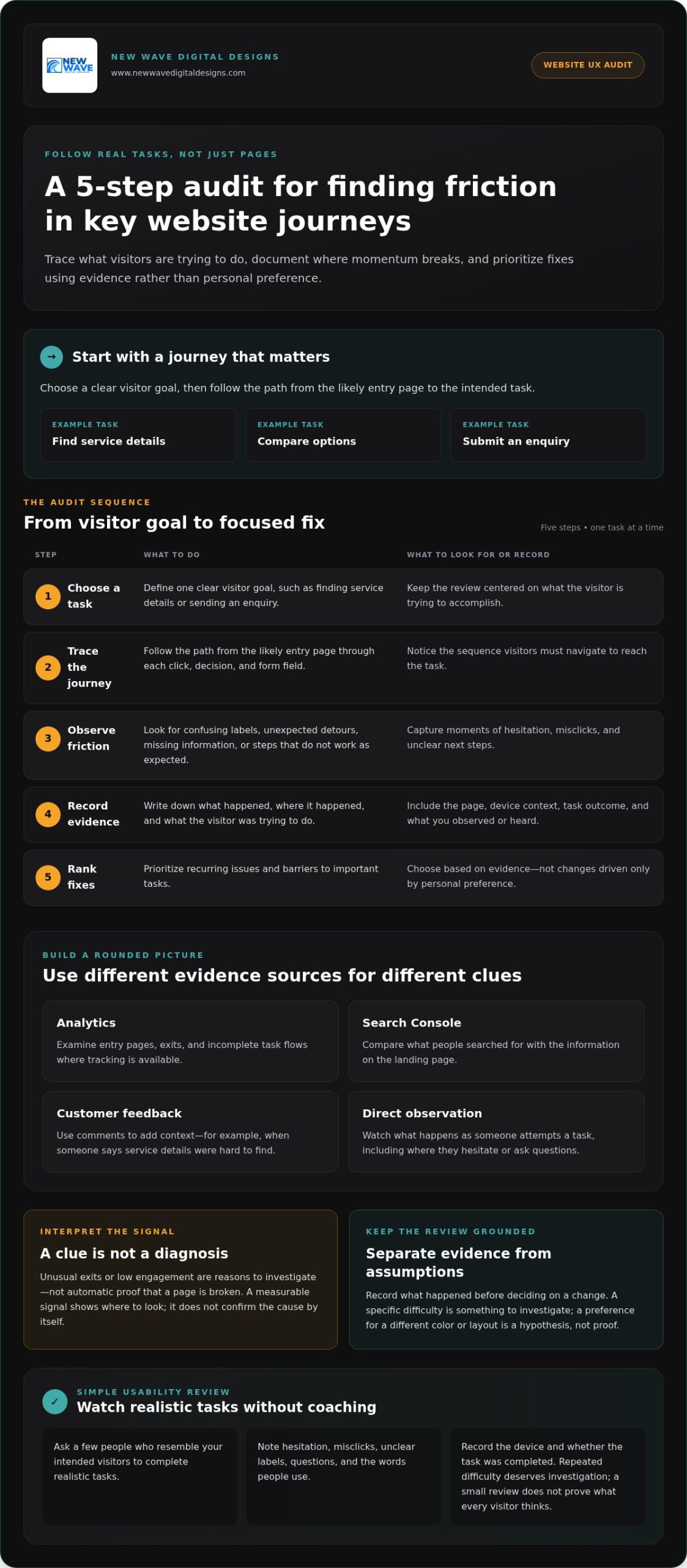
A useful UX review follows real tasks, not just a checklist of separate pages. Choose journeys that matter to your business, such as finding a service, comparing options, or submitting an enquiry. Then follow each path as a visitor would, from the page they enter to the action they want to complete. This gives you a practical starting point for improving user experience on my website without jumping straight to a redesign.
Use this five-step audit to turn observations into a focused set of improvements:
- 1. Choose a task. Define a clear goal, such as finding service details or sending an enquiry.
- 2. Trace the journey. Follow the path from the likely entry page through each click, decision, and form field.
- 3. Observe friction. Note confusing labels, unexpected detours, missing information, or steps that don’t work as expected.
- 4. Record evidence. Capture the page, device context, task outcome, and what you observed or heard.
- 5. Rank fixes. Prioritize recurring issues or barriers to important tasks, rather than changes based only on personal preference.
Combine different perspectives: analytics can show where visitors enter or leave, Search Console can reveal what people expect from search results, customer feedback adds context, and direct observation shows what happens during a task. The user experience basics also connect research, usability evaluation, information architecture, and accessibility, which are useful lenses for a rounded review.
What website data can reveal about user experience
Use analytics to examine entry pages, exits, and incomplete task flows, where tracking is available. Search Console queries can help you compare what people searched for with the information they find on a landing page. Treat unusual exits or low engagement as reasons to investigate, not automatic proof that a page is broken. A measurable signal shows where to look; it doesn’t, by itself, confirm the cause.
How to run a simple usability review
Ask a few people who resemble your intended visitors to complete realistic tasks without coaching. Watch for hesitation, misclicks, unclear labels, and questions. Record their words rather than interpreting them too quickly, and note the device used and whether the task was completed. Repeated difficulty deserves investigation, but a small review doesn’t prove what every visitor thinks.
When observations point to connected design or development issues, a coordinated website design approach can address the journey as a whole instead of patching one symptom at a time.
Which website UX improvements should you prioritize first?
Once you’ve identified friction, choose what to fix first. Start with barriers that affect important tasks, such as understanding an offer or completing an enquiry. A decorative refinement may improve a page’s appearance, but it shouldn’t outrank a confusing form or a navigation path that repeatedly blocks visitors.
Compare potential changes across five areas: content clarity (is essential information easy to understand?), navigation (can visitors find the right page?), forms (can they complete the task without unnecessary effort?), accessibility (can people with different needs use the content and controls?), and performance (does the site respond smoothly?). Base the fix on the problem you observed, not on which area sounds most urgent.
Use a simple impact, effort, and confidence matrix to make your decision clear. Rate each proposed change as high, medium, or low across all three dimensions. Impact reflects how much it could improve an important journey; effort estimates the work involved; confidence reflects the strength of your evidence. Prioritize changes with high impact, manageable effort, and solid evidence. If the potential impact is high but confidence is low, gather more observations before committing.
- High impact, low effort, high confidence: consider doing it first.
- High impact, high effort: plan the work and identify dependencies.
- Low impact or low confidence: defer the change or investigate further.
Which usability fixes can you make without rebuilding the site?
Many improvements can start with the content and components already in place. Clarify page headings, make calls to action specific, replace vague link labels, and make essential service information easy to find. Remove form fields that aren’t needed for the task, and explain beside each required field why the information is requested. Where the existing design allows, strengthen visual hierarchy and use styles consistently so visitors can recognize what matters and what they can interact with.
When does a redesign become the more considered option?
A redesign may make sense when friction spans several templates, the navigation structure, and the way the brand is presented. Compare recurring issues, their shared causes, and the dependencies between fixes. If changes to one page keep creating problems elsewhere, coordinated design and development may be more coherent than a series of isolated patches. Not every UX concern calls for a new platform or full rebuild; match the scope to the evidence. For broader principles, explore this 2026 web design guide.
Improving user experience on my website doesn’t mean changing everything at once. It means choosing the next useful change with care, then checking whether it actually makes the visitor’s task clearer.
How to improve website UX across mobile, accessibility, and performance
A page can look polished on a large monitor yet become difficult to use on a phone, with a cramped menu, hard-to-read text, or an awkward form. A repeatable review helps uncover these gaps. Apply the same checks to key pages after updates, not just during a redesign.
- Mobile layout: Check that content fits the screen, headings and body text remain readable, and images don’t obscure important information.
- Navigation: Open the menu, follow links, and make sure visitors can reach important pages without losing their place.
- Forms: Complete the form on a phone. Check that fields are easy to select, instructions are clear, and errors can be understood and corrected.
- Accessibility: Test keyboard navigation, visible focus, contrast, descriptive labels, and a logical heading structure.
- Performance: Review available performance reports and investigate pages that load or respond slowly. Treat speed as one part of the experience, alongside clarity and accessibility.
How to review mobile usability and website performance
Test representative mobile screen sizes and complete real tasks, such as finding a service or submitting an enquiry. Don’t stop at the homepage: menus, buttons, images, and forms can behave differently on deeper pages. Look for controls that are difficult to tap, text that requires awkward zooming, or images that push useful content out of view.
Use performance reports to identify pages for closer testing. Core Web Vitals offer a current framework for assessing loading, interactivity, and visual stability; responsiveness is measured by Interaction to Next Paint (INP). A report can point to a potential issue, but testing the affected page helps reveal what visitors actually experience.
What accessibility checks belong in a UX review?
Try using the site with a keyboard alone. Can you reach links and controls in a sensible order, see which item has focus, and operate the navigation? Check that form fields have descriptive labels, headings create a logical outline, and text and controls have sufficient contrast. Alternative text should convey an image’s relevant meaning, rather than repeat nearby copy or describe decorative details unnecessarily.
Automated accessibility scans can flag some issues, but they can’t judge every page in context. Use WCAG 2.2 as a current reference point, and review applicable requirements before making compliance claims. Accessibility is an ongoing part of improving user experience on my website, not a one-time scan.
Mobile usability, accessibility, and performance need continued attention as content and technology change. Include these checks in routine website maintenance, or plan ongoing website care to support a functional experience over time.
How ongoing design, testing, and maintenance keep UX improving
A website experience is never entirely finished. Content changes, new features are added, and visitor needs evolve. A steady improvement cycle helps you respond without turning every issue into a major project: observe, prioritize, implement, test, and refine.
- Observe: Review visitor feedback, task completion, and recurring points of confusion.
- Prioritize: Choose a problem that affects an important journey and is supported by evidence.
- Implement: Make a focused change, such as clarifying content or adjusting a page flow.
- Test: Check that the change works as intended across the relevant pages and devices.
- Refine: Keep what helps, revise what doesn’t, and note any new friction that appears.
Your team may be able to handle a small, contained edit when the issue is clear and the change is easy to review. If several pages share structural problems, or navigation, visual hierarchy, and brand presentation need to work together differently, coordinated design or development can provide a more coherent path. Improving user experience on my website is more sustainable when each change addresses a clear need and is checked after it goes live.
How to measure whether a UX change helped
Before changing a page or flow, define the task you want to make easier and note a baseline signal. For an enquiry form, that might be completion activity, form errors, or recurring questions about what information to provide. After implementation, review the same signals and test the task directly. Look for a pattern, not a single data point, and consider whether traffic, seasonality, or other site changes could have affected the result. This helps you avoid crediting one adjustment for a change it may not have caused.
When professional website design or maintenance can help
When friction connects page structure, visual hierarchy, and visitor journeys, a coordinated design project can address those elements as one experience. New Wave Digital Designs creates custom websites on Shopify, WordPress, and Squarespace, tailoring the design to the business and its goals. Ongoing website maintenance and secure hosting support a site’s technical function as it evolves.
If you’re ready to turn your observations into a considered plan, explore website design and maintenance support as a collaborative next step.
Make your next website improvement count
A clearer website isn’t built by changing everything at once. It grows through deliberate steps: follow important visitor journeys, use evidence to find friction, and prioritize fixes that make key tasks easier. Then test the changes and keep refining the experience across mobile, accessibility, and performance.
That steady approach makes improving user experience on my website more manageable and purposeful. When issues connect across page structure, visual hierarchy, and development, a considered design partnership can bring them together. New Wave Digital Designs creates custom websites for Shopify, WordPress, and Squarespace, with website maintenance, managed hosting, and security services to support ongoing care.
Explore a more thoughtful website experience with New Wave Digital Designs and take the next step toward a site that feels clear, trustworthy, and easier to use. Every well-chosen improvement can help your website better reflect your business and guide visitors with confidence.
Frequently Asked Questions
What is the fastest way to improve user experience on my website?
Start with one important visitor task and observe where people hesitate, abandon, or ask for help. A practical first fix might be clarifying a vague page heading, simplifying navigation labels, or removing an unnecessary form field. Choose a barrier you’ve actually observed, make one focused change, then check whether the task becomes easier through direct testing or relevant website data.
How can I tell if my website has a poor user experience?
Look for recurring difficulties across visitor behavior and feedback. People may struggle to find essential information, abandon a form, ask questions the site should answer, or fail to complete a key task during testing. No single metric confirms a UX problem by itself. Compare analytics with customer comments and direct observation to identify patterns, then investigate the cause before deciding what to change.
Can I improve my website UX without redesigning it?
Yes, many UX improvements can be made within an existing website. You can clarify page copy, use more descriptive links, simplify forms, improve navigation labels, or create a clearer visual hierarchy with existing design elements. Start with a high-priority visitor journey and test the changes. If friction is connected across the site’s structure, page templates, and brand presentation, a coordinated redesign may offer a more cohesive solution.
How do I prioritize website user experience improvements?
Rank each potential change by its likely impact on an important task, the effort involved, and the strength of the evidence behind it. Address repeated barriers on high-priority journeys before lower-impact refinements. A simple list or matrix can make your reasoning clear and keep decisions grounded in observed needs. Revisit the ranking as feedback and website data reveal new patterns or show whether earlier changes helped.
Does website speed affect user experience?
Yes, slow or inconsistent loading can interrupt browsing and make tasks harder to complete. Speed is one part of UX, alongside clear content, usable navigation, accessibility, and reliable forms. Use available performance reports to identify pages that deserve closer investigation, then test the complete visitor journey. A single speed score can point to a concern, but it won’t explain every usability issue or show the full experience on its own.
How often should I review my website’s user experience?
Review important visitor journeys after substantial content, design, or technical changes, and establish a recurring check that fits your site’s activity. Watch for repeated support questions, shifts in task completion, and new usability feedback. A steady review helps you notice friction without overreacting to every small fluctuation. If a pattern emerges, investigate its context before deciding whether a targeted adjustment or broader work is appropriate.
Do I need special tools to improve website UX?
No, you can begin with your website, available analytics, customer questions, and observed usability sessions. Specialized tools may help when you need deeper behavior or feedback analysis, but they can’t replace a clear question and a practical test. Decide what you need to learn first, then choose tools that support that purpose. This keeps research focused on useful next steps rather than collecting data without a plan.