
A beautiful storefront can still lose sales if shoppers can’t navigate it easily. The clearest signs you need a new e-commerce website include persistently weak conversions, a frustrating mobile experience, slow-loading pages, and products that are hard to find. When several problems appear together, the cause may run deeper than outdated images or buttons.
It’s frustrating to invest in attracting visitors only to see them leave before buying. Start by identifying where the shopping journey breaks down and whether targeted updates could fix it or the site needs a broader redesign. This guide covers warning signs, from declining performance and mobile friction to slow pages and confusing product discovery, to help you decide what your store needs.
Key Takeaways
- Compare conversion trends and checkout drop-offs over time to distinguish a persistent usability problem from a temporary dip.
- Test the complete shopping journey on a phone, from product browsing through checkout, and note where effort or confusion builds.
- Use Core Web Vitals to pinpoint whether loading, responsiveness, or visual stability is undermining the experience.
- Ask people unfamiliar with your store to find specific products and observe where navigation or search leaves them stuck.
- Match the remedy to the problem: a focused refresh may be enough when the site’s underlying structure still supports your business.
1. Bounce rates, conversion rates, and abandoned carts
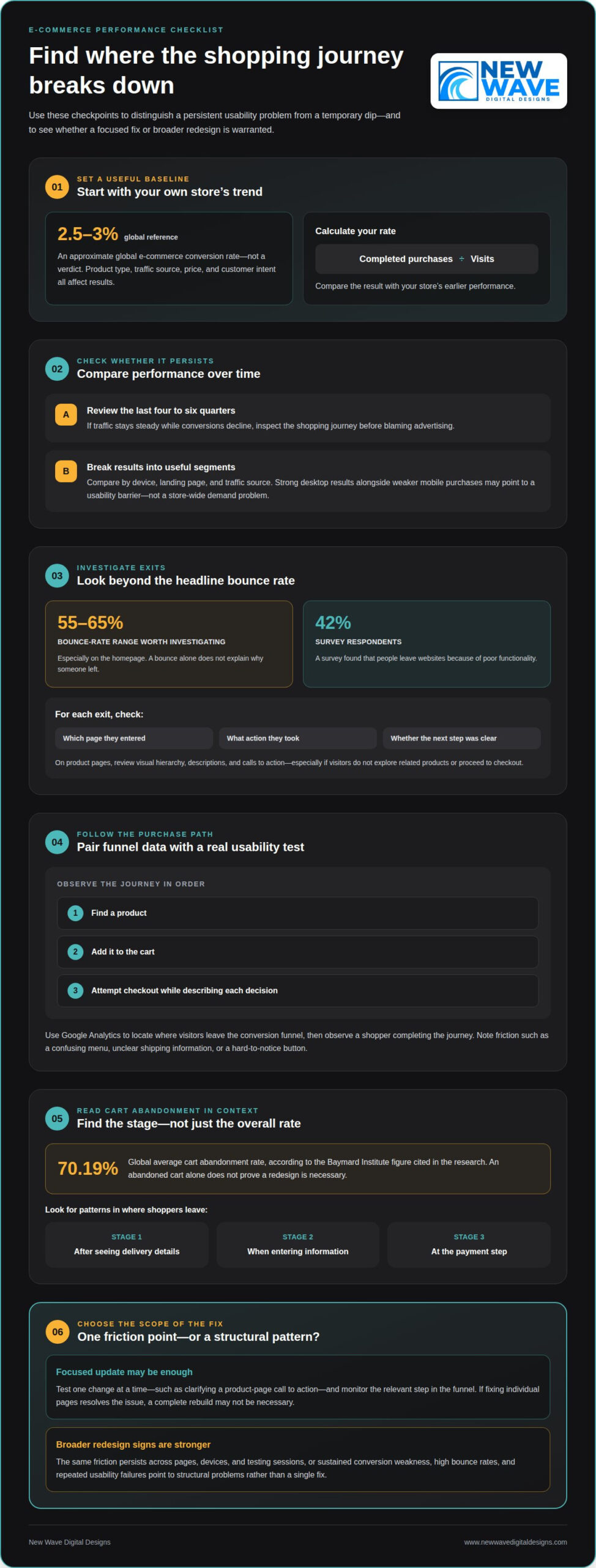
A good e-commerce conversion rate is approximately 2.5-3% globally. Treat that as a broad reference, not a verdict: product type, traffic source, price, and customer intent all affect results. Calculate your store’s rate by dividing completed purchases by visits, then compare it with your own earlier performance.
When traffic stays steady but conversions decline, inspect the shopping journey before blaming advertising. Compare conversion trends across the last four to six quarters to see whether the change persists. Then break down the data by device, landing page, and traffic source. Strong desktop results alongside weaker mobile purchases, for example, may point to a usability barrier rather than a store-wide demand problem.
Bounce rate adds another clue. Ecommerce bounce rates above 55-65% are worth investigating, especially on the homepage. A bounce alone doesn’t explain why someone left, so examine the page they entered, the action they took, and whether the next step was clear. If visitors arrive on a product page but don’t explore related products or proceed to checkout, review its visual hierarchy, descriptions, and calls to action.
Use Google Analytics to identify where visitors leave the conversion funnel, then pair that data with usability testing. Ask a shopper to find a product, add it to the cart, and attempt checkout while describing each decision. A confusing menu, unclear shipping information, or a button that’s hard to notice can turn interest into hesitation. A survey found that 42% of people leave websites because of poor functionality, making observed friction worth addressing.
Cart abandonment needs similar investigation. The global average cart abandonment rate is 70.19%, according to the Baymard Institute figure cited in the research, so an abandoned cart isn’t automatically proof that a redesign is necessary. Look for patterns: do shoppers leave after seeing delivery details, when entering information, or at the payment step? A consistent drop at one stage gives you a more useful target than the overall rate.
Test one change at a time, such as clarifying a product-page call to action, then monitor the relevant step in the purchase funnel. If the same friction persists across pages, devices, and testing sessions, the signs you need a new e-commerce website become stronger. A redesign is more compelling when sustained conversion weakness, high bounce rates, and repeated usability failures suggest structural problems rather than a single fix.
2. Mobile-friendly design
An outdated e-commerce website often shows its age through cramped mobile layouts, tiny controls, crowded menus, or product details that disappear off-screen. If customers have to pinch, zoom, or scroll repeatedly to take action, the design is creating avoidable friction. Google uses mobile-first indexing, so the mobile version also matters when pages are assessed for search.
Check the entire shopping journey on a phone, not just the homepage. Open a category, select a product, review its details, add it to the cart, and proceed to checkout. Look for cut-off buttons, overlapping text, difficult-to-use filters, and forms that reset unexpectedly. A layout that looks polished on desktop can still make these steps difficult on a smaller screen.
Compare mobile and desktop analytics to spot differences in product views, cart additions, and completed orders. If mobile visitors arrive but often leave before taking key actions, test the affected pages at different screen sizes and identify the exact point of friction.
Business growth can also outpace an existing design. A store that adds product categories, for example, may find its original homepage and menu no longer guide customers clearly. New audiences, a wider product range, or a changed brand identity can make the old structure feel restrictive. For creative brand owners and designers scaling their digital presence, platforms like IAMFASHION highlight how critical it is that an online store matches brand evolution. Compare current customer needs with the pages and features your website supports. A persistent mismatch may require more than visual updates.
Compare your visual presentation with customer expectations in your market, rather than copying another store’s style. Faded product photography, inconsistent typography, or an unclear value proposition can make a site feel neglected. Cluttered navigation adds to the problem: if customers have to scan competing menu labels to find a category, the site structure needs attention. A modern design should make the next action easy to spot.
Security and payment warning signs include browser security alerts, checkout errors, failed payment attempts, or payment steps that don’t work smoothly on mobile. These issues can interrupt a purchase and undermine customer confidence. Review the full checkout flow, from product selection to confirmation, and note error messages, broken buttons, or confusing transitions.
A redesign can bring risks such as broken links, missing product information, and disrupted customer journeys. Reduce them by documenting current pages, recording important URLs, and testing key paths before launch. For example, confirm that returning customers can still find a product category and complete checkout on a phone.
Before deciding, list the mobile problems, the pages they affect, and the customer action each one blocks. If fixing individual pages resolves the issues, a complete rebuild may not be necessary. If outdated design, changing business needs, and mobile usability problems affect the store more broadly, they’re stronger signs you need a new e-commerce website, leading many growing brands to consult specialists like Mosster Services Limited to craft a streamlined digital presence.
3. Page speed and Core Web Vitals
A slow e-commerce website keeps shoppers waiting before they can examine products or act. Many users expect pages to load within two seconds, and pages taking more than two to three seconds can lose potential customers before they see the offer. If most of your pages take longer than three seconds, investigate promptly whether the underlying site needs an update.
Speed affects more than first impressions. Slower loading can be associated with weaker conversion performance. That doesn’t mean every slow page requires a complete website redesign; first identify which pages are slow and what’s delaying them. Large product images, unnecessary scripts, and complex page layouts can all contribute to longer waits.
Core Web Vitals help assess the experience beyond a single load-time number. Good targets include Largest Contentful Paint, or LCP, under 2.5 seconds; Interaction to Next Paint, or INP, under 200 milliseconds; and Cumulative Layout Shift, or CLS, under 0.1. These measures focus on how quickly key content appears, how promptly pages respond, and whether elements shift unexpectedly.
Test the same URLs consistently: homepage, category pages, product pages, cart, and checkout. Check them on both mobile and desktop, since a page that feels quick on one device may lag on another. Record the slowest page and its Core Web Vitals results, then retest after each update. This comparison helps distinguish a troublesome template from a broader performance problem.
Pay attention to what visitors experience as a page loads. A product image that appears late, an unresponsive menu, or a checkout button that shifts as content loads can interrupt the shopping journey. If category pages repeatedly load slowly while simpler pages perform well, examine shared images and scripts on that template before replacing the whole site.
A redesign makes more sense when slow performance affects most pages, persists after targeted improvements, and reflects limitations in the site’s structure. If the issue is limited to a few images or one template, focused changes may be enough. Use measured load times and Core Web Vitals, alongside the customer actions affected, to decide whether a targeted update or a broader rebuild is more practical.
4. Mobile usability and device-level performance
A page can fit a phone screen and still be difficult to use. Responsive web design needs to adapt more than page width: menus, product images, filters, and purchase controls must remain clear and usable. A category page, for example, may resize correctly while a large promotional banner hides its filter button. Check that essential actions stay visible as the layout changes.
Test the store on a mid-range phone, not just a recent flagship device. Open the homepage, browse a category, and inspect a product page at a customer’s natural pace. Check whether text is readable without zooming, buttons respond to taps, and menus close after a selection. Testing on a device can reveal friction a desktop preview misses.
Review touch interactions separately. Try selecting a product option, opening an image, and closing a pop-up with one hand. If controls are too close together, customers may tap the wrong option or lose their place. On product pages, keep key details and the add-to-cart action easy to find as shoppers scroll through images and descriptions.
Compare key pages across screen sizes and orientations. A homepage may look balanced in portrait mode but feel crowded when a customer turns a phone sideways. Check that navigation doesn’t cover product content, text doesn’t collide with images, and important actions remain clear. Record each issue by page and device to see whether it’s isolated or part of a wider design problem.
A responsive website can deliver a mobile experience without requiring a separate mobile application. That keeps the store consistent across devices rather than sending customers to another destination. Check whether your current web design presents the same product details, categories, and purchase steps on each device. Missing or inconsistent information can create doubt even when every page loads.
Distinguish a mobile usability issue from a broader platform limitation. If a homepage banner blocks navigation, revising that component may solve the problem. If product pages, filters, and checkout all require awkward workarounds on a mid-range phone, the underlying structure may be holding the store back. Document the customer action affected and test the revised experience on the same device. Repeated barriers across the site are stronger evidence that a redesign should address mobile usability from the ground up.
5. Product discovery, navigation, and site search
Customers should be able to find relevant products without decoding your menu. Test product discovery by asking five people outside your team to find three products. Watch where they pause, select the wrong category, or abandon the task. Their first attempts can reveal labels that make sense internally but don’t match the words shoppers use.
Review the journey from the homepage to a product page. Group related categories under clear names, use consistent menu labels, and make search easy to find. If customers have to open several unrelated dropdowns to find a product type, for example, simplify the hierarchy. Treat site search as part of navigation, too: test whether a familiar product name returns the right result.
Readability can hinder product discovery even when the right pages exist. Long menus, dense category descriptions, low-contrast text, and inconsistent labels slow shoppers down. Ask testers to complete a task, then note how long it takes and where they hesitate. The three-click rule suggests people should find what they need in three clicks, but that idea has been challenged. Judge the experience by successful task completion, not a rigid click count.
Google rankings shouldn’t be the only reason to change navigation. A clear structure helps visitors understand how products relate, while descriptive category names make pages easier to interpret. Check whether key categories are reachable from the homepage and whether each product page links back to a useful category. If shoppers and search engines encounter unclear paths, reorganizing the site may support both discovery and visibility.
Separate a navigation problem from a platform limitation before choosing a solution. If clearer labels, reordered categories, or improved search settings resolve the issue, a focused redesign may be enough. Consider migration if the current platform prevents essential changes, such as building a workable category structure or supporting product discovery. Compare your business’s current requirements with what its system can handle.
Test the experience before committing to a solution: give people a specific product-finding task, observe their route, and record where they get confused. Repeat after adjusting labels or page hierarchy. If people still struggle because the site structure can’t accommodate the catalog, a broader rebuild or platform migration may make sense. If improved navigation solves the task, keep the structure and refine the experience instead.
If product discovery remains difficult across key categories, get help planning a clearer e-commerce website around how customers browse and shop.
New Wave Digital Designs: Shopify Website Design
New Wave Digital Designs creates Shopify websites for businesses that need clearer structure, stronger product presentation, or a more usable shopping journey. A purpose-built redesign can align your storefront with your goals as your business evolves. The team also designs websites on WordPress and Squarespace and provides Website Maintenance for ongoing site needs.
Bring your priorities into the conversation: where customers struggle, which pages need attention, and what your store should support next. These details give the design work a practical foundation, shaped around your business rather than visual changes alone.
To discuss your e-commerce website needs, contact New Wave Digital Designs or visit www.newwavedigitaldesigns.com.
Turn your findings into a clear next step
Recognizing the signs you need a new e-commerce website is only the beginning. Next, decide what a better customer journey should make possible, then use that goal to guide design choices. Start with the business outcome you want your storefront to support, such as helping shoppers understand your offer or explore your catalog. A clear goal gives your redesign direction beyond simply looking newer.
Before making changes, write down the customer tasks your website must support and the obstacles you want to remove. This gives you a practical basis for planning and evaluating options, while keeping the experience aligned with your business as it evolves. New Wave Digital Designs can turn those priorities into a considered website design.
Contact New Wave Digital Designs to discuss a thoughtful next step for your e-commerce website. With a clear purpose guiding the work, your storefront can better reflect your business and welcome customers into a more intuitive experience.
Frequently Asked Questions
How do I know if my ecommerce website needs a redesign?
Consider a redesign when recurring problems affect several parts of the shopping journey, not just one page. Look for patterns such as staff relying on workarounds to update products, customers struggling to compare options, or new business goals the current layout can’t accommodate. Document each issue, its impact, and the pages involved. This helps distinguish a design problem from a content or process issue that can be changed separately.
How do slow page speeds affect e-commerce conversion rates?
Slow pages can interrupt a purchase before shoppers reach the details they need to decide. Delays on a product page may prevent images or options from appearing promptly, while sluggish cart updates can leave customers unsure whether an action worked. Review performance throughout the purchase path, including filtering and cart interactions. This shows whether delays cluster around one feature or affect the store more broadly.
How can I tell if my e-commerce site is not mobile-friendly?
Try completing a purchase on your phone in its default browser, with the screen set to its normal text size. Check whether product information stays readable, forms are comfortable to use, and the checkout summary remains clear as you enter details. Test browser back navigation, too: if it unexpectedly clears selected products or entered information, the mobile journey needs attention. Repeat the test on another phone or browser to uncover device-specific inconsistencies.
How do high bounce rates and cart abandonment indicate website problems?
High exit rates can signal friction, but their location and context matter. Compare pages with similar traffic sources, then check whether visitors leave before viewing product details, after selecting options, or during checkout. A campaign landing page may attract the wrong audience, while repeated exits at one checkout field may point to a confusing step. Consider session patterns and customer feedback together before deciding what to change.
When should a business redesign or rebuild its e-commerce website?
Redesign when the existing foundation can still support the store but its presentation or customer journey needs restructuring. Rebuild when essential requirements depend on capabilities the current setup can’t provide, such as a different product organization or connections to business systems. Before deciding, identify what must remain stable, including product records and essential customer journeys. Those requirements help define a practical project plan.
How can I audit an e-commerce website before deciding to rebuild it?
Start by inventorying important pages, products, integrations, and customer tasks. Review analytics for changes in performance by page and traffic source, then test common tasks as a shopper. Ask staff which updates require repeated workarounds and record each issue’s business impact. Group findings into content, design, usability, and technical needs to see whether targeted improvements or a broader rebuild is the better fit.