
A website earns a conversion when a visitor takes a meaningful next step, such as making a purchase, submitting an inquiry, booking a service, or signing up for updates. Website design that converts visitors into customers makes those actions clear and easy to complete. The goal is not simply to attract attention, but to guide visitors toward an action that fits their needs.
That takes more than an attractive layout. Visitors need to understand what you offer, see why it matters to them, and feel confident about what to do next. If your site gets visits but few inquiries or sales, its message and calls to action may need closer attention.
This article explains what website conversions look like and how conversion-focused design supports them. You’ll learn how landing pages clarify an offer, how thoughtful visuals build trust and direct attention, and how tracking reveals what to improve. Together, these elements create a more considered path from first impression to action.
Key Takeaways
- Make each landing page’s offer easy to grasp, with a clear next step that guides visitors without overwhelming them.
- Shape mobile experiences around readable content, intuitive navigation, and actions that are simple to complete.
- Use purposeful visuals and credible trust signals to help visitors feel confident about moving forward.
- Track meaningful actions and user behavior to identify friction and make informed improvements.
- Align each page with a specific visitor need so the design supports a useful next step across the site.
1. What is a high-converting landing page?
A high-converting landing page focuses on one audience, one offer, and one next step. For example, a bookkeeping service could invite small-business owners to request a consultation. The page explains the service, addresses a likely concern, and guides interested visitors to a contact form. Its design connects the offer to an action instead of leaving visitors to work out what to do.
A landing page differs from a homepage because it serves a more focused conversion path. A homepage introduces a business and directs visitors to different areas, such as services, background, and contact details. A landing page typically supports one campaign or offer, keeping its message and calls to action aligned. For example, an ad about a specific service can lead to a page explaining that service, rather than to a general homepage.
Begin with a value proposition above the fold, the portion visible before scrolling. State what visitors can get and why it may be useful. A project-management service might say, “Organize client work in one shared workspace,” then briefly explain the benefit. Place a relevant call to action nearby, such as “Request a product demo.” Visitors can then connect the promise with a practical next step.
Design calls to action around the decision you want visitors to make. Use specific, action-oriented wording that sets expectations, such as “Book a consultation” or “View service options.” A short page needs a clear call to action, while a longer page can repeat the same primary action where it makes sense. Keep buttons visually distinct and give them enough space to stand apart from nearby text.
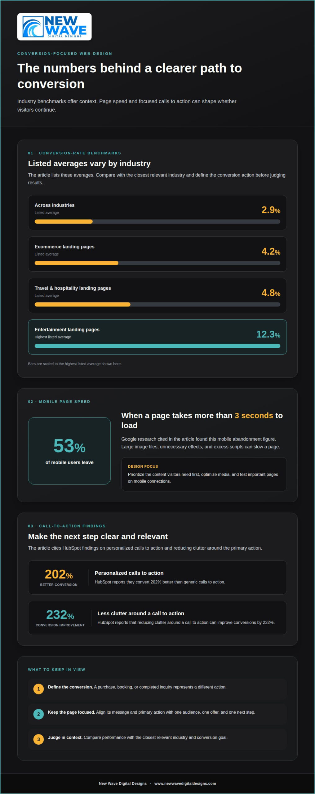
Use one primary call to action for the main goal, supported by a secondary option for visitors who need another route. A software landing page might make “Start a trial” primary and “Compare plans” secondary. This hierarchy helps visitors choose without presenting competing priorities. According to HubSpot, personalized calls to action convert 202% better than generic ones, making audience-specific wording worth considering.
Place calls to action at natural decision points, such as after the offer, after explaining a benefit, and near the closing summary. Each placement should continue the same conversion path, not introduce an unrelated request. After reading a service’s key benefits, for example, a visitor might see “Request a proposal.” Keep the contact form consistent with that promise, so the action feels like a clear continuation.
Clarity matters more than decorative complexity. According to HubSpot, reducing clutter around a call to action can improve conversions by 232%. Remove nearby links or visual elements that distract from the primary button, and make the next step obvious. This disciplined approach gives website design that converts visitors into customers a measurable purpose: connect a relevant offer with a clear, focused action.
2. What is conversion-focused web design?
Conversion-focused web design arranges content and interactions around a visitor’s next useful action. A mobile visitor arriving from a service ad, for example, should find the relevant service details without searching through unrelated pages. The layout, loading speed, navigation, and forms all shape that route. Each element should help visitors understand the offer and complete their intended task.
Effective layouts make the next step easy to find, whether visitors arrive on a phone or computer. A service page can lead with a concise introduction, followed by benefits, testimonials, and a contact form. A simple navigation menu and visible contact details help visitors explore without losing their place. Keep the page structure consistent while giving the primary action clear visual priority.
Start responsive design with the smallest screen, then expand the layout for larger displays. On mobile, stack sections vertically, keep text readable, and make buttons easy to tap. For example, a product page can show the product name, essential details, and purchase action before lengthy descriptions. Check that menus, forms, and key content remain usable across screen widths.
Page speed also matters on mobile. Google research found that 53% of mobile users leave if a page takes more than 3 seconds to load. Large image files, unnecessary effects, and excess scripts can slow a page. Prioritize the content visitors need first, optimize media, and test important pages on mobile connections. Faster access helps preserve the path from discovery to action.
Accessibility strengthens the experience for visitors using different devices and assistive technologies. Use descriptive headings, clear form-field labels, and meaningful link text. Ensure buttons have visible focus states and sufficient contrast against their backgrounds. For example, identify each contact form field by name rather than relying on placeholder text alone. These details make navigation and task completion clearer.
There isn’t one useful conversion-rate target for every industry. The listed averages are 2.9% across industries, 4.2% for ecommerce landing pages, 4.8% for travel and hospitality landing pages, and 12.3% for entertainment landing pages. Compare performance with the closest relevant industry and conversion goal. A purchase, booking, or completed inquiry represents a different action, so define the conversion before judging results.
In the United States, conversion-focused website design costs depend on scope, platform, functionality, content, and integrations; the price is given after a quote request. A focused redesign of one landing page has a different scope from building a full ecommerce experience. Define which pages, features, and conversion actions the project needs before estimating its work.
For a site that feels difficult to use on mobile, a responsive website design can bring its content and actions into a clearer arrangement across screen sizes.
3. Why Are Visuals Important in Web Design?
Visual design shapes how visitors read a page, recognize a brand, and judge its credibility. Northumbria University research found that 94% of first impressions of a website relate to its design. That makes more than decoration: a clear visual hierarchy can show what matters first. For example, a service page can give its headline, key benefit, and contact option distinct levels of prominence.
Consistency gives a business a more coherent, professional presence. Choose a restrained color palette, readable type, and image style that reflect the brand’s character, then apply them across the homepage and service pages. A bakery, for instance, might pair warm photography with simple navigation and consistent headings. Familiar layouts also help visitors find details and browse with confidence.
Trust signals work best when they’re specific and easy to assess. Customer reviews, named testimonials, client logos, and relevant affiliations can help visitors evaluate a business before contacting it. BrightLocal research found that 95% of consumers read online reviews before making a purchase. Display reviews near relevant services or products, and keep the wording and attribution clear so visitors understand whose experience they’re reading.
Placement matters. A testimonial beside a service description can address doubts as they arise, while a logo or affiliation near the company introduction can provide context. Avoid presenting these elements as a wall of badges. Instead, select evidence relevant to the visitor’s decision. A professional services page, for example, might pair a client quote with the specific outcome it describes.
Visual hierarchy can also make helpful content easier to use. Break a long explanation into descriptive headings, short paragraphs, and carefully chosen diagrams or photographs. Keep navigation labels distinct from decorative text, and use whitespace to separate related ideas. Adobe’s State of Content report found that 38% of users stop engaging entirely when site content or layout is unattractive. Clear structure helps visitors find the information they came for.
Realistic, well-composed photography can make a brand feel more tangible than generic imagery. Show the people, products, or setting visitors can expect, and use captions when an image needs context. A service business, for example, can use a photograph of its actual workspace rather than an unrelated stock image. Pair each visual with useful copy, so appearance reinforces substance instead of standing in for it.
Helpful content completes the trust-building picture. An explanation of pricing processes, a service comparison, or a concise answer to a common concern gives visitors something practical to evaluate. Organize the material with visible headings and links that describe their destinations. When reviews, visual identity, and useful information work together, the site gives visitors a clearer basis for taking the next step.
4. Conversion tracking and optimization
Optimization begins by defining what counts as a conversion. An online store might track completed purchases, while a service business tracks submitted inquiries. Set up an event for each action, then compare completed actions with relevant visits. The conversion rate offers a useful starting point, but needs context: traffic source, device, and landing page can all affect results. Track bounce rates, page performance, and user behavior alongside conversions to understand where visitors proceed or leave.
A practical review follows the visitor’s journey. First, identify a page with meaningful traffic and a clear goal. Next, use analytics reports to see where visitors exit or stop interacting. Then inspect the page on mobile and desktop, checking links, forms, and buttons. For example, a product page with views but few cart additions may need clearer product details or a more visible purchase action.
Change one element at a time when testing a page. An A/B test can compare two versions of a call-to-action button, such as different wording or placement, then measure clicks and completed conversions. Keep the audience and goal consistent between versions. The results will be easier to interpret than if you change the headline, button, and page layout together.
Forms deserve close attention. A 2024 HubSpot study found that each additional form field decreases conversion rates by an average of 4.1%. Review every field against the information needed to respond. A service inquiry form might request a name, email address, and a brief description, while removing questions that can wait until later. Fewer unnecessary steps can reduce friction between interest and submission.
For ecommerce, examine the full checkout journey from cart to purchase. A required account, unexpected extra costs, too many steps, or limited payment options can interrupt completion. Show key costs and delivery information clearly before the final action. Keep fields focused, explain errors beside the relevant input, and preserve entered details when a correction is needed. Each adjustment should remove a specific obstacle, not merely change the checkout’s appearance.
Optimization tools help turn observations into decisions. An analytics dashboard can organize conversion events, traffic sources, and device performance. A heatmap can show where visitors click or how far they scroll, while session recordings can reveal confusing interactions. Use these tools to form a testable explanation, such as “mobile visitors miss the size guide,” then revise the page and measure the same actions.
Content and SEO also influence the quality of incoming visits. Use clear headings, relevant keywords, semantic page structure, and useful answers that match search intent. A page about a specific service should explain its benefits and process rather than rely on broad claims. After publishing changes, compare search traffic and conversion behavior. This connects visibility with meaningful outcomes instead of treating visits alone as success.
5. Conversion-focused web design and its benefits
Conversion-focused design aligns a visitor’s reason for arriving with the page’s message and next step. Someone searching for “emergency plumbing service” needs different information from someone researching bathroom renovations. Map each audience’s intent to a relevant page, then shape its headline, supporting details, and action around that need. This makes the experience coherent from first click to inquiry.
Start intent mapping by grouping visitors according to what they want to accomplish. For a fitness studio, one group may seek class schedules, while another wants personal training. Give each group a suitable destination rather than sending everyone to a generic homepage. Then match the page’s message to its traffic source, so an ad promising beginner classes leads to beginner-specific details.
Benefit-focused copy describes what changes for the customer, not just what a business provides. “We offer bookkeeping” names a service; “Spend less time sorting receipts and more time running your shop” connects it to a practical outcome. Follow that benefit with supporting details, such as which records the service organizes. Specific language helps visitors judge whether the offer fits their needs.
Use a clear content sequence to answer likely questions before asking visitors to act. A landscaping page, for example, can explain the service area, describe the design process, and show how to request an estimate. Each section should add information rather than restate the headline. This structure lets visitors move at their own pace and reach a decision with useful context.
Conversion-focused design also gives each page a defined role. A product page supports evaluation and purchase; an About page explains the people and principles behind the business. A service page can describe the process, benefits, and expected customer involvement. When these roles are distinct, visitors can move between pages without encountering conflicting messages or repeated, generic claims.
Intent mapping can guide content improvements after launch. If visitors arrive through a search about wedding photography but leave without exploring packages, the page may not answer their questions clearly. Add relevant details, such as the delivery format or booking process, where they naturally fit. Search terms, landing-page behavior, and completed inquiries together can reveal where the content needs a more precise connection.
When your pages attract visitors but the message doesn’t match their needs, a considered redesign can bring the experience into alignment. Explore conversion-focused website design to shape clearer journeys, stronger messaging, and purposeful page structure around your business goals.
New Wave Digital Designs
New Wave Digital Designs helps businesses shape websites around clear messaging, purposeful visitor journeys, and meaningful actions. If your current site attracts visits but makes it difficult for people to understand your offer or take the next step, a strategic redesign can bring those elements into alignment.
Whether you’re building a new site or refining an existing one, Shopify, WordPress, and Squarespace website design can support a more coherent experience for your audience. Website maintenance can help keep your site updated and functional as your content and business evolve. The right approach depends on your platform, goals, and where visitors need a clearer path.
For thoughtful support in making your website easier to navigate and act on, contact New Wave Digital Designs.
Shape the Next Chapter of Your Website
A website should evolve alongside your business. The next step is to choose one meaningful improvement, connect it to a clear customer need, and make space to learn from what happens. That could mean refining a page’s message, clarifying a visitor’s route, or making a key interaction easier. Small, deliberate adjustments can give your website a stronger foundation for continued growth.
Think of website design that converts visitors into customers as an ongoing practice, not a finish line. Each change should reflect your brand, serve a real audience need, and support your business direction. With a considered approach, your site can become a more purposeful expression of what you offer.
If you’re ready to explore what a more thoughtful digital experience could look like for your business, contact New Wave Digital Designs. A clear conversation can help set your next steps in motion.
Frequently Asked Questions
What are examples of website conversion?
Website conversions include purchases, quote requests, appointment bookings, newsletter signups, and account registrations. The right example depends on what the business wants visitors to do. An online shop might count completed orders as its main conversion, while a consultant may focus on qualified inquiries. Smaller actions, such as downloading a guide, can also indicate interest. Track each action separately so the data shows which visitor behaviors support business goals.
What is a high-converting landing page?
A high-converting landing page helps a specific audience complete a relevant action. Its content should match the reason someone arrived, such as an ad promoting a particular service. For example, a page for a tax preparation offer can explain whom it serves, what information to gather, and how to request help. Measure completed actions, not just clicks, to understand whether the page attracts useful responses.
What is conversion-focused web design?
Conversion-focused web design organizes a site around the tasks visitors want to complete and the business outcomes those tasks support. Someone comparing service options, for example, needs a clear route to details and a way to follow up. Consider the whole experience, including navigation, page content, and forms, rather than treating the button as the only important element. The aim is to make useful interactions easier to understand and complete.
Why Are CTAs Important?
Calls to action make the next step explicit, so visitors don’t have to guess how to proceed. A button labeled “Download the planning guide” tells people what happens after clicking, unlike a broad label such as “Continue.” Match the wording to the destination and action. If a button opens a booking form, say so clearly. This consistency sets expectations and makes the interaction feel intentional.
Why Are Visuals Important in Web Design?
Visuals help visitors understand information and recognize what a business offers. A product photograph can show details that a description may struggle to convey, while a simple diagram can clarify a multistep process. Choose visuals that support the page’s purpose, not images added only for decoration. Provide descriptive alternative text for meaningful images, so visitors using assistive technology can understand their content and role.
Why Does Site Speed Matter?
Site speed matters because slow pages can interrupt browsing before visitors reach useful information or complete an action. A delayed product page, for example, can disrupt someone comparing options or trying to add an item to a cart. Large media files and unnecessary page elements can contribute to delays. Review key pages on different devices and connections, then address slow elements that interfere with reading, navigation, or checkout.
Why is Building Trust Important?
Trust helps visitors feel comfortable sharing information, making a purchase, or starting a conversation. Clear contact details, accurate service descriptions, and a transparent explanation of what happens next can reduce uncertainty. For example, an inquiry form can explain who will receive the message and what information is useful. Keep claims consistent across pages, and use testimonials or credentials only when they accurately represent real experiences and qualifications.
Why is Mobile Optimization Important?
Mobile optimization matters because visitors should be able to complete key tasks on smaller screens. A prospective customer might arrive from a search, read service details, and want to call or submit an inquiry from a phone. Make essential content easy to scan, keep navigation clear, and ensure forms work comfortably on touchscreens. Test complete tasks, such as finding a service and sending a message, rather than checking appearance alone.