
A polished design alone doesn’t make a professional services website effective. What makes a good professional services website is a clear promise, an easy path to useful information, and a straightforward next step, supported by mobile-friendly pages and credible trust signals. Visitors should quickly understand who you help, what you do, and how to get started.
It’s understandable to focus first on appearance: visual design shapes a visitor’s first impression. But a website works best when it confidently guides prospective clients from the first headline to the contact page. A cohesive visual system and useful, current content reinforce the message without cluttering the page with unnecessary effects. Clear messaging, intuitive navigation, mobile design, purposeful calls to action, and relevant proof all help visitors decide whether your services suit their needs. Together, they create a site that feels polished and personal.
Key Takeaways
- Make core services and contact details easy to find so prospective clients can take the next step without friction.
- Give each page one clear action, using concise calls to action that match what visitors need at that point.
- Design for mobile with readable text, easy-to-tap buttons, and important information within easy reach.
- Write from the audience’s perspective, explaining who you help and how your services address their needs.
- Use relevant testimonials, case studies, and project examples to make your expertise more tangible and build trust.
1. What Makes a Website Feel Professional?
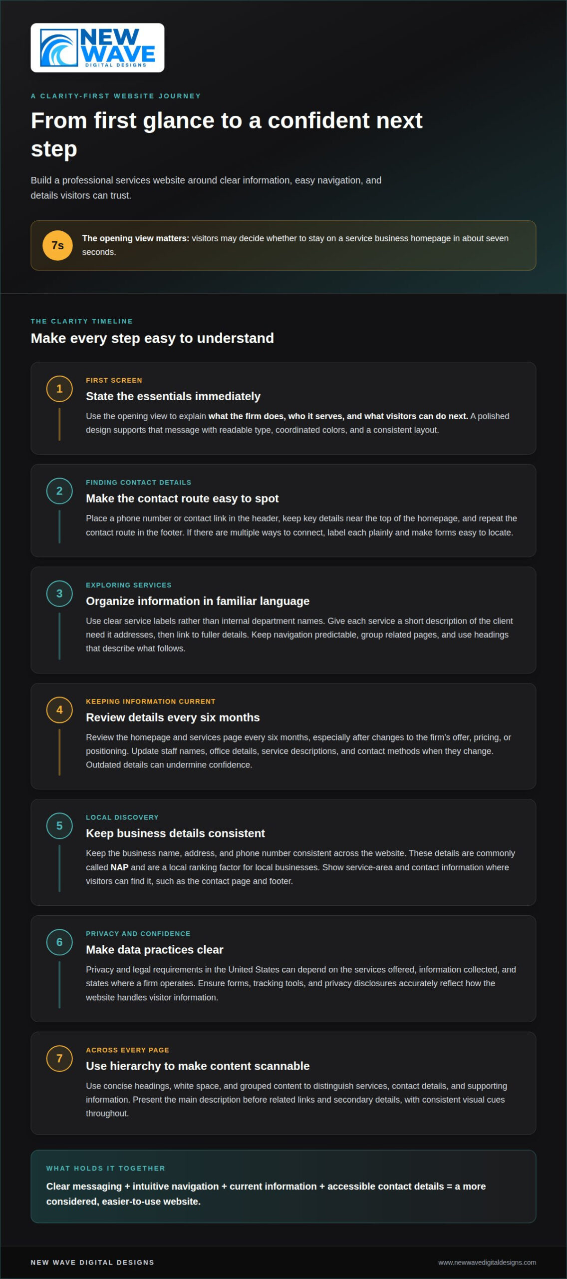
A professional impression begins with clarity, not decorative effects. Visitors may decide whether to stay on a service business homepage in about seven seconds. Use that opening view to state what the firm does, who it serves, and what visitors can do next. For example, a consulting firm can name its specialty, identify its intended clients, and point to a services page. A polished web design supports that message through readable type, coordinated colors, and a consistent layout.
Make contact information easy to find. Place a phone number or contact link in the header, and include key details near the top of the homepage. A clear “Contact” link in the top-right area can help visitors act quickly. Repeat the contact route in the footer, where people often look for business details. If the firm offers several ways to connect, such as a phone number and contact form, label each option plainly and make the form easy to locate. Clear service details and accessible contact options are part of what makes a good professional services website.
Present core services in familiar language. A law firm, for example, might group its practice areas under clear labels rather than internal department names. Give each service a short description that explains the client need it addresses, then link to fuller details. Keep navigation labels predictable, group related pages, and use headings that describe the content beneath them. Organize information for visitors instead of making them piece it together themselves.
Keep every detail aligned with the business as it operates today. Review the homepage and services page every six months, particularly after changes to the firm’s offer, pricing, or positioning. Update staff names, office details, service descriptions, and contact methods when they change. A stale phone number or outdated service claim can undermine confidence even when the visual design remains refined. Regular website maintenance can help keep information accurate without requiring a full redesign every year.
For local search visibility, keep the business name, address, and phone number consistent across the website. These details are commonly called NAP, and they are a local ranking factor for local businesses. Place the firm’s service area and contact information where visitors can find them, such as the contact page and footer. If an office moves, update the address wherever it appears on the site. Consistent details support both local discovery and a smoother path from search results to a direct inquiry.
In the United States, privacy and legal requirements can depend on the services offered, information collected, and states where a firm operates. Make data practices clear, and ensure forms, tracking tools, and privacy disclosures accurately reflect how the website handles visitor information.
Give each page a clear visual hierarchy. Use concise headings, white space, and grouped content to distinguish services, contact details, and supporting information. For instance, a services page can present its main description before related links and secondary details. A logical structure, consistent visual cues, and current information help explain what makes a good professional services website feel considered and easy to use.
2. Clear calls to action
A call to action gives each page a clear next step. Use a specific label, such as “Schedule a consultation” or “Request a proposal,” rather than a vague “Learn more.” The wording should match what happens after the click. If a visitor reaches a consulting firm’s strategy page, an invitation to discuss strategy fits better than a generic sign-up prompt. A clear action helps visitors understand the page’s purpose and decide whether to proceed.
On the homepage, pair the main promise with a supporting detail and a relevant action. A financial advisory firm might explain who it serves, name the planning challenge it addresses, and invite visitors to discuss their goals. Make the primary button visually distinct, and ensure its destination matches its label. “Book a consultation” should lead to a scheduling step or inquiry form, not an unrelated overview page. This continuity makes the promise feel credible and the journey coherent.
Give each page one primary objective. A page crowded with competing buttons can leave visitors unsure whether to call, download a guide, join a mailing list, or browse services. Choose the action that best suits the page’s role. A service page can invite an inquiry, while a resource article can offer a related guide. Secondary links still have a place, but their visual treatment shouldn’t compete with the primary action.
Match calls to action to the visitor’s likely journey. Someone arriving from a Google search for a specific service may need a concise explanation and a direct way to inquire. A visitor reading an educational article may still be exploring, so a useful resource or related service page can be a more natural next step. Forms connected to valuable resources can invite email sign-ups and support continued communication. Keep each form focused, explain what the reader will receive, and make the submission button explicit.
Use action language that describes the benefit or task, not the interface. “Talk through your project” feels more informative than “Submit,” while “Download the planning guide” tells visitors exactly what follows. Place buttons near the relevant explanation, repeat them where a long page naturally reaches a decision point, and make their labels consistent. After a form submission, provide a clear confirmation so visitors know the action worked. If paid search brings people to a landing page, align its headline, offer, and Google Ads campaign message so the click leads to the experience promised.
3. Mobile optimization
Mobile design is part of the main experience, not a smaller version added later. More than 60 percent of web searches happen on mobile, so prospective clients may first encounter a firm on a phone. A responsive, fluid layout adapts columns, text, and navigation to different screen sizes. For example, a three-column desktop service grid can become a clear, single-column sequence on a narrow screen. The key points should remain visible without horizontal scrolling or awkward zooming.
Speed matters on the same small screen. A service business website that takes more than three seconds to load on a phone risks losing a significant portion of potential clients before they read its content. Large images, unnecessary scripts, and crowded page elements can weigh down the experience. Google PageSpeed Insights can help identify performance issues; a score below 70 is a prompt to address mobile performance. Focus on the specific bottlenecks rather than adding visual effects that slow the page.
Readable content and usable controls make mobile browsing feel effortless. Body text should be comfortable to read without pinching to zoom, while buttons need enough space for accurate taps. A phone number should work as a phone link, and a menu should open and close without covering important content. For example, a prospective client reading a therapist’s service page should be able to reach the inquiry form without hunting through a desktop-style navigation bar.
Test the complete journey on real mobile screen sizes. Open the homepage, a service page, and a contact form, then follow the links as a visitor would. Check whether headings wrap cleanly, menus remain usable, and buttons lead to the expected destination. Review forms for narrow fields, hard-to-select dropdowns, and error messages hidden below the keyboard. These checks reveal friction that a desktop preview can miss.
Mobile layouts also need a thoughtful visual hierarchy. Keep the main service message near the top, with supporting details following in a clear order. Use images that fit the screen without making visitors scroll past a large banner before reaching useful information. A consulting firm, for instance, can place its expertise summary before secondary credentials, then make related details easy to expand or scan. Consistent spacing and restrained design keep the focus on the content.
Finally, check mobile performance after meaningful site changes. New plugins, embedded tools, or oversized media can affect loading and functionality. A recurring review of key pages can catch broken links, layout shifts, or forms that stop working after updates. Reliable hosting and website maintenance can support that ongoing attention, while mobile testing confirms that each page remains accessible, fast, and functional on phones and tablets.
4. Brand positioning and audience specificity
Positioning is clear when visitors can tell who a firm serves and why its work matters. A tax practice for independent contractors, for example, should name that audience rather than describe itself only as “a full-service accounting firm.” Lead with the client’s concern, such as managing business taxes, then explain the relevant service. This audience-first approach makes the firm’s purpose easier to understand and helps prospective clients recognize whether the offer fits.
Specific language also distinguishes a firm from alternatives without relying on broad claims. Instead of saying “personalized solutions,” a design consultancy might explain that it helps growing teams refine customer onboarding. The message should identify the audience, the problem, and the firm’s approach. Use terms clients understand, not internal acronyms or corporate phrases. A first-time visitor should be able to describe the firm’s value after reading its homepage.
Build each page around a distinct audience need. A human resources consultancy serving small businesses and nonprofit organizations could create separate service paths for hiring support and workplace policy guidance. Each path can explain its audience, the relevant challenge, and what to explore next. This structure avoids asking visitors to sort through one broad list and gives search engines clearer context about each page.
Keep the brand recognizable across the homepage, service pages, email, and social media. A consistent voice, visual style, and description of the firm help visitors connect each touchpoint. For example, if a firm emphasizes clear, practical guidance on its website, its social media posts should use the same accessible language. Consistency doesn’t mean repeating identical copy. It means expressing the same point of view in a way that suits each channel.
Fresh content should answer real questions from the intended audience. A business law firm might publish an explainer about preparing for a contract review, while an architecture practice could describe how a project moves from initial brief to design development. Organize each piece around one subject, use headings that make it easy to scan, and connect it to a relevant service page. Useful articles show how the firm thinks and give visitors value before they inquire.
To keep content audience-focused, turn recurring client questions into a simple editorial plan. Group topics by service, note the language clients use, and choose one question for each article or page. For a financial planning practice, questions about retirement goals and cash-flow planning could become distinct resources. Review each draft for clarity: does it name the reader, explain a relevant need, and offer a meaningful next step? This process grounds the firm’s positioning in the people it aims to serve.
5. Trust signals, testimonials, and case studies
Potential clients need evidence that a firm can deliver the work described on its website. Choose trust signals that connect directly to the service, such as relevant project photos, team information, professional memberships, awards, or client results. A consulting firm might show a case study beside the service it demonstrates, rather than putting every credential on a separate page. Each signal should help visitors understand the firm’s experience, approach, or expertise.
Testimonials are most useful when they describe a real client’s experience in specific, familiar language. A comment such as “The team helped us clarify our hiring process” gives more context than “Excellent service.” Place the testimonial near the related service or next step, so readers can connect the client’s words with the work being discussed. Use actual feedback and clear attribution where appropriate. Never shape a quote to imply an outcome the client didn’t describe.
Case studies can make an abstract service tangible. A strong example explains the client’s problem, the firm’s approach, the result, and the benefit to the client. For instance, an operations consultant could describe a workflow challenge, outline the changes made, and show how the new process addressed it. Include measurable results when they’re available and supported by the client’s experience. A case study should show the path, not just announce success.
If a service business has two or three solid examples to share, a portfolio or case studies page can help visitors explore its work. Give each example a clear title and a brief summary before the deeper account. A reader can then scan for relevant industries, project types, or client needs. This structure helps people find evidence that relates to their situation, rather than asking them to interpret an unorganized gallery.
Customer reviews, client logos, association badges, media recognition, and awards can strengthen a website when they’re relevant and accurately presented. A professional membership badge, for example, should identify the organization clearly. Reviews can reflect the language prospective clients use, helping visitors recognize a familiar concern. Trust signals support credibility, but they shouldn’t crowd out useful service information or imply promises the evidence cannot support.
Place proof at decision points: a testimonial beside a consultation invitation, or a relevant project result near a service explanation. This gives visitors evidence while they consider their next step. Trustworthy examples can also make a firm’s expertise clearer to people arriving through search engine results or other traffic sources. To build a more cohesive, credible presence, refine your professional services website around clear evidence of your work.
New Wave Digital Designs
New Wave Digital Designs helps professional services firms shape websites around clear messaging, useful visitor journeys, and a cohesive visual identity. If your site feels outdated, obscures your services, or no longer reflects your practice, custom website design for Shopify, WordPress, or Squarespace can bring its structure and presentation into alignment. Website maintenance can help keep content and functionality current as your business evolves.
The right approach depends on your platform, audience, and goals. New Wave Digital Designs can help you refine the experience, from the first impression to the contact pathway. Contact New Wave Digital Designs to discuss your website.
Shape the Next Version of Your Website
A website can evolve alongside the firm it represents. New services, changing client needs, and fresh examples of your work may all call for thoughtful updates. Rather than treating the site as a finished artifact, view it as part of an ongoing relationship with prospective clients. Each refinement can make the experience better reflect your practice and the people you serve.
Understanding what makes a good professional services website means treating design as a strategic foundation, not a one-time polish. The next step might be clarifying a page’s purpose, refining its visual direction, or planning a more cohesive structure. New Wave Digital Designs can help translate those priorities into a considered website project shaped around your business.
Discuss your website project with New Wave Digital Designs, and take the next step toward a digital presence that feels true to your work.
Frequently Asked Questions
What Makes a Website Feel Professional?
A website feels professional when its details appear intentional and reliable. For example, a consulting firm can use consistent page titles, a recognizable logo, and working links that lead to the promised information. Proofread service descriptions, remove outdated announcements, and use a clear footer on every page. These finishing details help the site feel cared for, while a visual style suited to the firm’s work makes the experience distinctive.
How do I create a strong service brand online?
Build a strong service brand by defining the clients you serve, the problem you solve, and the perspective that shapes your work. A bookkeeping firm for independent contractors, for instance, can make that focus visible in its homepage copy and educational resources. Use the same brand voice across your website, email, and social media. Then choose examples and visuals that reinforce the same promise rather than presenting disconnected messages.
What are the three keys to a successful website?
Three useful foundations are relevance, usability, and credibility. Relevance means a visitor quickly sees content that fits their need, such as a business owner finding an accounting service for startups. Usability means pages and forms work as expected across devices. Credibility comes from evidence, such as a clearly explained process or a client example. Review these foundations together: an attractive site can still lose inquiries if its forms fail.
What makes a good business website for a service provider?
A good service business website helps the right person move from interest to an informed decision. A home renovation consultant, for example, might describe project types, explain the stages of an engagement, and answer common planning questions. Include content for visitors at different stages: a service overview for early research and a detailed process page for people comparing options. This gives prospective clients a useful way to assess fit before contacting the firm.
Why isn’t my website generating inquiries even though I have traffic?
Traffic may not turn into inquiries if visitors land on pages that don’t match their search intent or offer a clear next step. Compare the page attracting visits with the service it promotes. For example, a visitor seeking bookkeeping help may leave if the landing page focuses on general business consulting. Review landing-page relevance, form usability, and the path from entry page to inquiry. A mismatch in any of these can interrupt the journey.
What are the essential elements of a professional services website?
Core elements include a focused homepage, individual service pages, a clear explanation of the firm’s process, and a way to make an inquiry. Add an about page that introduces the people behind the work, plus useful resources that answer common client questions. For example, an accounting firm could explain what documents a new client might gather for an initial conversation. Each page should have a purpose and contribute to a coherent experience.
How should a professional services website clearly explain its services and value proposition?
Describe each service through the client’s situation: name the problem, explain the work involved, and clarify what the client can expect from the process. A cybersecurity consultant might describe an assessment as a review of systems and risks, then outline how the findings guide next steps. Keep claims specific and support them with examples or a process overview. Avoid unexplained acronyms, and define specialist terms where readers need them.
What website design best practices build trust with professional services clients?
Trust grows when design makes information easy to assess and claims easy to understand. Use consistent page templates, readable contrast, working links, and clear ownership details. For example, a law firm can identify the authors of its articles and distinguish general educational content from personalized legal advice. Keep testimonials tied to the services they describe, and present credentials or memberships with accurate names. A well-maintained site also signals care through functional forms and current content.