Do photographers and artists need a website when social platforms can display their work? A dedicated portfolio gives creative work a focused home, and Squarespace for a photographer’s or artist’s portfolio can bring images, project details, and clear navigation together in one considered experience. It isn’t the only way to share work, but it offers a space shaped around how you want people to see it.
A strong portfolio doesn’t make visitors work to see the art. It puts the work first, guides people through related projects, and makes essential information easy to find. Thoughtful colors and fonts support the images rather than compete with them.
The examples ahead show how photographers and artists use clear navigation, visual hierarchy, color, and typography to create coherent, inviting portfolios. You’ll also see how layout choices work across creative practices, helping you identify what will present your own work clearly.
Key Takeaways
- Keep navigation clear and focused so visitors can move easily between your work and essential information.
- Choose colors and fonts that establish a visual identity without competing with the art or photography.
- Compare portfolio layouts by how well they showcase individual pieces and organize complete projects.
- Consider which Squarespace plan features fit your portfolio’s needs before settling on a setup.
- Organize high-resolution images to present the work clearly while supporting a smooth browsing experience.
Artist portfolio navigation and visual hierarchy
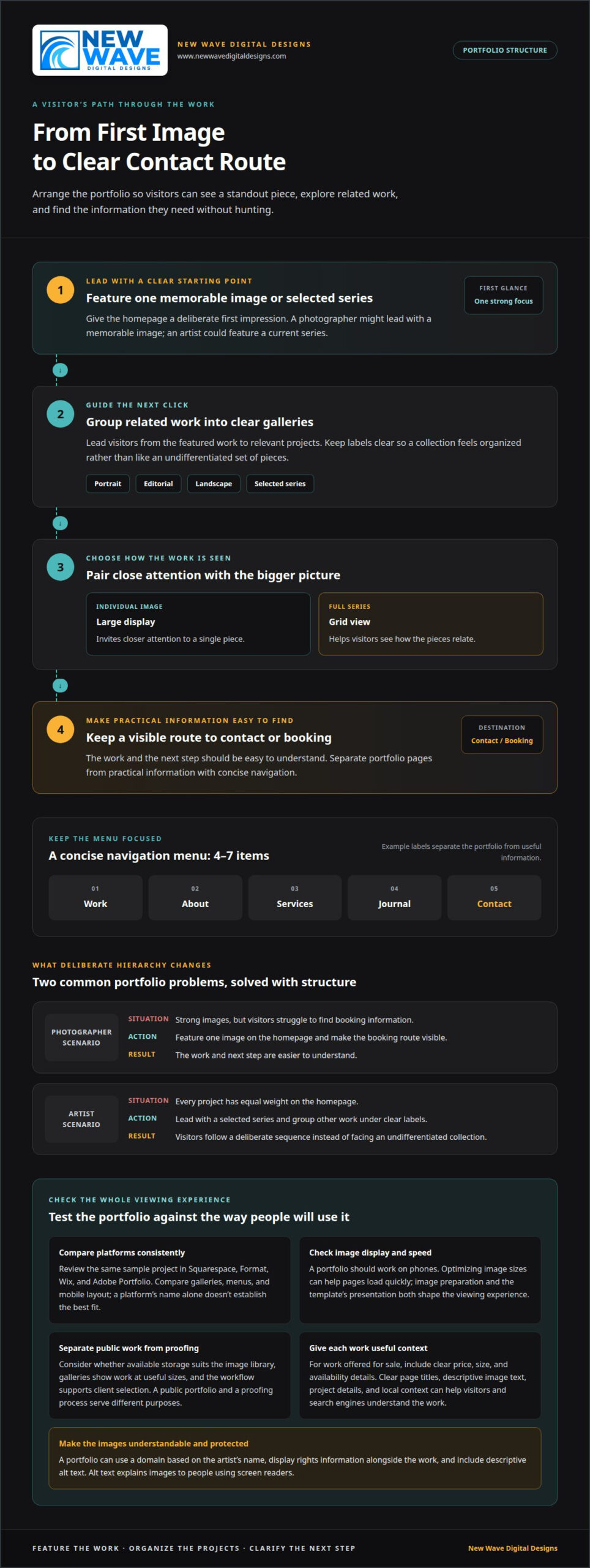
A strong Squarespace portfolio makes work easy to find and gives each project room to stand out. Start with the visitor’s likely path: see a featured piece, explore a related series, then find contact or booking details.
Keep navigation concise. A menu of 4-7 items gives visitors clear routes without crowding the header. For example, “Work,” “About,” “Services,” “Journal,” and “Contact” can separate the portfolio from practical information.
Use visual hierarchy to guide attention. A photographer might lead with a memorable image, followed by links to portrait, editorial, and landscape galleries. An artist could feature a current series before presenting a selection of other work.
Consider two complementary views: a large display of an individual image and a grid showing a full series. The large view invites closer attention; the grid helps visitors see how the pieces relate.
Situation: A photographer has strong images, but visitors struggle to find booking information. Action: A professional features one image on the homepage and makes the booking route visible. Result: The work and next step are easier to understand.
Situation: An artist’s homepage gives every project equal weight. Action: The designer leads with a selected series and groups other work under clear labels. Result: Visitors follow a deliberate sequence instead of facing an undifferentiated collection.
What should you consider when choosing a Squarespace alternative for a creative portfolio? Compare templates, gallery presentation, navigation control, mobile display, image handling, and the path from viewing work to making contact or booking. The right fit depends on how your projects should be seen and organized.
How does a professional compare Squarespace with Format, Wix, and Adobe Portfolio for photographers? They assess each platform against the same portfolio needs, then review how a sample project appears in its galleries, menus, and mobile layout. A platform’s name alone doesn’t establish the best fit.
Does Squarespace optimize portfolio images for speed and mobile devices? A portfolio should work on phones, and optimizing image sizes can help pages load quickly. Image preparation and the template’s presentation both shape the viewing experience.
How can artists sell prints, originals, or photography through Squarespace? Present each work with clear details, including price, size, and availability. A professional can shape the sales path around the work, whether visitors are considering a print or an original.
How do professionals build a photographer or artist portfolio website on Squarespace? They organize work into meaningful projects, choose a template that supports those projects, and structure pages around viewing and contact needs. The creator provides images, project context, and essential business information.
What are the limitations of Squarespace for image storage, galleries, and client proofing? Consider whether the available storage suits the image library, galleries display work at useful sizes, and the workflow supports client selection. A public portfolio and a proofing process serve different purposes.
Can Squarespace portfolios improve SEO and attract photography clients? Clear page titles, descriptive image text, relevant project details, and local context can help search engines and visitors understand the work. These elements support discoverability, but don’t replace a focused portfolio and a clear contact route.
Does Squarespace support custom domains, image rights notices, and accessibility features? A portfolio can use a domain based on the artist’s name, display rights information alongside the work, and include descriptive alt text. Alt text explains images to people using screen readers.
How professionals select colors and fonts for an artist portfolio
Color and typography frame the work. A professional studies the images, medium, and intended audience, then chooses a visual system that supports all three. A painter using saturated reds may need a quieter page than a photographer whose images already feature broad areas of white.
Begin with the artwork’s dominant visual qualities. For a muted landscape collection, warm white, charcoal, and restrained green can echo the subject without competing with it. For vivid abstract paintings, a neutral background can keep the color relationships at the forefront. The aim isn’t to decorate every page, but to make each gallery feel intentional.
Contrast also affects readability. A pale background with dark text works well for detailed captions, while light text on a dark field may suit a dramatic, full-screen image. Professionals test both treatments beside actual portfolio images: a color that looks elegant alone may obscure a subtle edge or change how a photograph’s tone appears.
Typography calls for similar restraint. A distinctive display font can give page titles character, while a highly legible companion font keeps captions, project notes, and contact details easy to scan. For example, a sculptor might pair a refined serif heading with a clean sans-serif body font, adding personality without making descriptions feel ornamental.
Situation: A portrait photographer’s selected images use soft light and gentle skin tones. Action: The designer creates a restrained palette and chooses simple type for labels. Result: The gallery feels calm, and faces remain its strongest visual element.
Situation: An illustrator’s portfolio features bold shapes and energetic colors. Action: The professional uses a quiet page background and reserves an accent color for links or section markers. Result: The interface complements the work without echoing every color at once.
Consistency matters across the homepage, project pages, and gallery captions. Professionals define a small set of roles: a background color, text color, accent, heading style, and body style. They test these choices on both phone-sized and larger screens. A long project title, short caption, and contact link each reveal different legibility issues.
Color schemes shouldn’t distract from artwork or photography. Review the same images against the chosen background, check text contrast, and remove accents that draw attention away from the subject. This measured approach makes the portfolio’s visual identity clear rather than loud.
If your portfolio’s visual language feels disconnected from its work, portfolio website support can help bring the design into alignment.
What Squarespace templates do professionals recommend for photographer and artist portfolios?
No single Squarespace template suits every photographer or artist. Professionals choose a layout by considering the work, the visitor’s likely path, and the portfolio’s needs. A clean, minimalist design is a strong starting point because it puts the artwork first, without decorative elements competing for attention.
Begin with the portfolio’s visual structure. A photographer with distinct portrait and landscape projects may need a landing page leading to separate galleries. A painter presenting one cohesive series may benefit from a template that introduces the collection before revealing individual pieces. In either case, check that images have room to breathe and project titles remain legible.
Then review how the template handles different content. A gallery grid helps visitors scan a series, while a larger single-image view draws attention to detail. An artist with process notes may need space for text beside or below the work. A photographer seeking booking inquiries needs an easy-to-find contact route.
Situation: A wedding photographer presents galleries, service details, and booking information. Action: The professional chooses a layout that prioritizes image sequences while keeping service and contact pages easy to reach. Result: Couples can explore a complete wedding story and find the next step without searching through unrelated content.
Situation: A printmaker’s work features fine lines and subtle texture. Action: The designer selects a restrained layout and checks how the gallery displays detailed pieces and captions. Result: The presentation supports close viewing instead of reducing each print to a thumbnail.
Compare candidate templates using the same sample project. Check the homepage, a project page, navigation, and the mobile view. A striking homepage isn’t enough if project pages feel crowded or visitors can’t find their way back to the main portfolio. This comparison shows whether the design stays coherent throughout the experience.
Consider how the portfolio may grow, too. A new collection, exhibition announcement, or journal entry can change the site’s structure. A flexible layout should accommodate additions without burying established work. For example, an illustrator adding editorial projects could use distinct project categories instead of one expanding, unfiltered gallery.
For Squarespace for photographers and artists portfolios, the most effective template follows the work’s particular rhythm. Professionals prioritize clear image presentation, readable supporting information, and a consistent experience on phones and larger screens. They treat the template as a framework, refining its spacing, page order, and content hierarchy to suit the creative practice.
Which Squarespace plan should a professional choose for a photography or art portfolio?
No single Squarespace plan suits every creative portfolio. Choose a plan whose included features match the site’s intended structure, selling needs, and future content. A photographer showcasing projects without online sales has different requirements from an artist selling original work.
Start by defining the portfolio’s purpose. A gallery designed to display work and generate inquiries needs project pages, background information, and contact details. A portfolio that also sells prints or originals needs a sales path and clear artwork details, including price, size, and availability. These requirements guide plan selection before visual design begins.
Next, map each essential function to the features available with each plan at the time of purchase. List whether the site needs an online store, journal, custom domain support, or additional site contributors. Compare that list with each plan’s included features, choosing according to real needs rather than automatically selecting the broadest option.
Situation: A landscape photographer needs a polished portfolio and booking inquiries, but no online shop. Action: The professional prioritizes portfolio pages, contact routes, and domain needs when assessing plans. Result: The selected plan fits the intended client journey without paying for unnecessary store functions.
Situation: A printmaker plans to sell originals and reproductions through the site. Action: The designer identifies the required selling features and compares them with each plan’s capabilities. Result: The choice accounts for both artwork presentation and the planned sales experience.
Growth matters, too. An artist may start with a focused portfolio, then add exhibition updates, writing, or products. A professional considers likely additions and whether the plan can accommodate them. For instance, a photographer moving from editorial work into print sales may need a different feature mix from a portfolio focused solely on commissioned assignments.
Separate must-haves from preferences. A custom domain or accessible project pages may be central to the site’s purpose, while optional integrations may not be necessary at launch. This distinction ties the decision to the portfolio’s actual use, not an abstract list of features.
Before choosing, professionals document the site map, sales requirements, and planned content. Then they compare those needs with Squarespace’s current plan features, including relevant limits. Since plan names and features can change, base the recommendation on the current offering, not an older template or a comparison from memory.
The best plan supports the portfolio’s work today and its clear next stage. A photographer seeking inquiries and an artist selling prints may need different capabilities. Matching requirements first creates a sound foundation for design, galleries, and future updates.
How do professionals upload and organize high-resolution images on Squarespace?
Professionals plan an image workflow before adding files to a Squarespace portfolio. They review the source images, select work to showcase, and prepare versions suited to the site’s layout. The goal is clear presentation without burdening every page with unnecessarily large files.
First, they curate the strongest work for each project. A wedding photographer might select images that establish the setting, show key moments, and close with portraits. An artist could group paintings by series, medium, or exhibition. This edit gives each gallery a coherent visual rhythm instead of presenting an unfiltered archive.
Next, a professional resizes images to suit the website design. A wide landscape photo intended for a banner has different proportions from a square artwork in a grid. Preparing files for their intended placements helps preserve the composition and avoids using one image size for every part of the site.
Image quality still matters. Portfolio images should be large enough to view clearly, especially when fine details or textures distinguish the work. A printmaker’s delicate linework, for example, needs a gallery presentation that keeps it legible. A photograph should retain the visual qualities that make the original compelling.
File organization supports a consistent upload process. Professionals can group prepared images by project and use descriptive filenames to distinguish works. For example, a portrait series folder might keep final selections separate from alternate frames. This structure helps prevent near-duplicates appearing together and makes later updates easier to manage.
Situation: A travel photographer has images from several assignments mixed together. Action: The professional sorts selected work into project groups, then prepares each image for its gallery placement. Result: Visitors can follow distinct stories, and the photographer can update a project without searching an unorganized library.
Situation: A painter’s large source files look sharp but slow portfolio pages. Action: The designer optimizes image sizes for their display roles while preserving enough detail for clear viewing. Result: The gallery balances visual fidelity with smoother browsing. Optimizing image sizes can help an artist’s portfolio load quickly.
Before publishing, professionals review each gallery on a phone and a larger screen. They check for cropped focal points, inconsistent spacing, and images that appear too small. A horizontal artwork, for instance, may need a different layout from a vertical portrait to preserve its intended emphasis.
For a polished, well-organized image library, get help refining your portfolio image workflow.
New Wave Digital Designs
New Wave Digital Designs helps photographers and artists build portfolio websites around their work and goals. Its web design service can bring together project pages, galleries, and clear visitor pathways in a considered structure. The site should reflect the artist’s practice while making essential information easy to find.
Turn to the team when your site needs thoughtful design or ongoing care after launch. Website maintenance and website support address continuing needs as a portfolio evolves, including adding projects or refreshing existing pages.
If you’re ready to discuss your portfolio, contact New Wave Digital Designs.
Let your portfolio grow with your practice
Your creative work will keep evolving, and your website can evolve with it. Treat the portfolio as a living part of your professional identity, making room for new directions without losing what makes your work recognizable. A Squarespace portfolio for photographers and artists should express the work as it is today while leaving space for what comes next.
As your digital needs grow, New Wave Digital Designs can help shape a website experience around your goals. The company also offers AI Agents for businesses exploring how AI could fit into their digital operations. The right next step depends on what you want your online presence to do, from presenting new work to supporting a broader digital strategy.
When you’re ready to explore your next step, contact New Wave Digital Designs. Your portfolio can become a clear, lasting home for the work you’re proud to share.
Frequently Asked Questions
Do photographers need a website?
A website gives photographers a dedicated place to present selected work and explain their services. For example, a family photographer can create a page for portrait sessions, describe their approach, and provide a clear booking route. Visitors can explore the photographer’s work without navigating unrelated posts. A website is especially useful when photographers want one consistent destination to share in email signatures, on business cards, or in client conversations.
What should an artist website include?
An artist website should include an About page, a Contact page, and a portfolio that reflects the artist’s practice. A concise bio can mention relevant education, exhibitions, awards, and location, while project pages provide useful context for each body of work. Artists can use a domain based on their name or medium. If the site sells artwork, include clear details to help visitors understand each piece before making an inquiry or purchase.
How does Squarespace compare with Format, Wix, and Adobe Portfolio for photographers?
Compare platforms against the same portfolio needs, then review how a sample project appears in the galleries, menus, and mobile layout. A platform’s name alone doesn’t establish the best fit.