
A consultant’s website builds trust when it makes their specialization clear, connects their work to client outcomes, and guides visitors toward a next step. Thoughtful website design for consultants and professional services can bring these elements together, with a value proposition focused on 3-5 key outcomes. Relevant examples and clear information about working together help prospective clients see whether the consultant’s expertise fits their needs.
Your website is often where a potential client decides whether your expertise fits their challenge. It should do more than look polished: it needs to make your value clear and your approach easy to follow. This article explores examples of website design for consultants and professional services that clarify a specialty, present outcomes, organize essential pages, and communicate pricing. You’ll also see how a defined process and carefully chosen proof can turn separate pages into a cohesive introduction to your work.
Key Takeaways
- Shape your value proposition around 3-5 outcomes so prospective clients can quickly see whom you help and how your work is relevant.
- Use focused examples and credible proof to make your expertise tangible, rather than relying on broad claims.
- Organize essential pages around the questions visitors need answered, from your services and experience to the next step in working together.
- Write outcome-led headlines and explain your process in clear, concise steps to help visitors understand what happens next.
- Present pricing information with context, and make the factors that shape an engagement easier to understand.
Clear value propositions and specialization
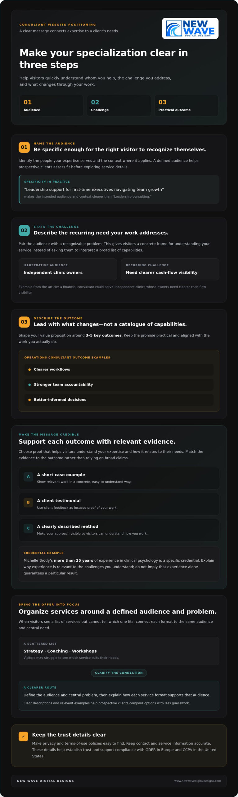
A consulting website needs to answer three questions quickly: whom do you help, what challenge do you address, and what changes through your work? Shape the value proposition around 3-5 key outcomes, not a catalogue of broad capabilities. For example, an operations consultant might focus on clearer workflows, stronger team accountability, and better-informed decisions. Those outcomes give visitors a concrete frame for understanding the service.
Make your specialization specific enough for the right visitor to recognize their needs. Name the audience, the problem, and the context where your expertise applies. “Leadership consulting” describes a field; “leadership support for first-time executives navigating team growth” points to a more defined need. This distinction helps visitors assess fit before exploring service details and gives your homepage and service pages a consistent message.
Build the message from evidence
Use this three-part exercise to sharpen your positioning: identify the audience, state the recurring challenge, then describe the practical outcome. A financial consultant serving independent clinics, for instance, could address owners who need clearer cash-flow visibility. Keep the language aligned with the work you actually do. A precise promise feels more credible than a sweeping claim about transforming every part of a business.
Then select proof that supports each outcome. Relevant evidence might include a short case example, a client testimonial, or a clearly described method. Michelle Brody’s more than 25 years of experience in clinical psychology illustrates how a specific credential can establish expertise. Pair credentials with an explanation of their relevance, such as the kinds of challenges your experience helps you understand. Avoid implying that experience alone guarantees a particular result.
Make the distinction visible
Consider an illustrative case: a consultant’s website lists strategy, coaching, and workshops, but visitors can’t tell which service suits their needs. The consultant groups those capabilities around a defined audience and central problem. Service descriptions then show how each format supports that audience. The result is a clearer route through the offer and less guesswork for prospective clients.
Trust also depends on the details surrounding your expertise. Privacy and terms-of-use policies help establish trust and support compliance with GDPR in Europe and CCPA in the United States. Make those policies easy to find, alongside accurate contact and service information. A defined specialization, relevant proof, and transparent site details make a stronger first impression than vague claims or crowded service lists.
Consultant website examples
Strong consultant websites make the visitor’s next decision easier. Look at how each example presents expertise, organizes evidence, and guides people toward contact. The details matter more than visual style alone.
For consultant and professional-services firms, WordPress, Squarespace, and Shopify can each support a website. The right platform depends on your content, design needs, and how visitors should engage. Choose based on those requirements, not a trend.
A template or website builder can suit a straightforward site with familiar page needs. Custom design can better support distinct content, branding, or visitor journeys, where creative partners such as LYFE Studio help teams execute tailored digital design projects. Choose the approach that lets you present your services clearly and maintain the site confidently.
Dan Pontefract: Make expertise immediate
Situation: A visitor needs to understand Dan Pontefract’s perspective and work quickly. Action: His website includes a 2-minute reel that introduces him through video. Result: The reel offers a concise way to encounter his presentation and ideas before exploring more of the site.
Illustrative case: A specialist with several services
Situation: A people-strategy consultant offers leadership advice, workshops, and speaking, but visitors struggle to distinguish them. Action: The consultant gives each service a clear description and relevant example. Result: Prospective clients can compare the options and identify a useful next step.
Illustrative case: An independent adviser
Situation: An adviser’s homepage relies on credentials, leaving visitors unsure what the work involves. Action: The adviser adds a short process overview and explains what clients receive at each stage. Result: The site presents expertise through a visible working method, not credentials alone.
Accessibility and privacy deserve attention on U.S. professional-services websites. Use readable text, keyboard-friendly navigation, descriptive form labels, and a clear notice explaining what information you collect and how you use it. These choices make the experience easier to understand and help visitors make informed decisions.
For SEO, give each core service a focused page, use descriptive headings, and write page titles that reflect the service and audience. Add useful examples and keep navigation links clear. Improve discoverability by publishing content that answers the questions prospective clients bring to your site.
There’s no single launch timeline for a professional-services website. The schedule depends on the number of pages, content readiness, design complexity, and review rounds. A clear scope and timely feedback help move the work through planning, design, and launch.
If these examples prompt a fresh look at your own site, explore consultant website design options as one way to shape a clearer digital presence.
Consulting website structure and pages
A consulting website should guide visitors from orientation to a relevant next step. Use plain labels in the main navigation: Home, Services, About, Case Studies, Insights, and Contact. These labels make the site structure easy to scan and help visitors find specific details, such as a leadership program or project example.
Start with the homepage, which introduces your focus and directs visitors deeper into the site. A clear headline, concise service summary, and visible navigation give the page a defined purpose. For example, a cybersecurity consultant could guide visitors to separate pages for risk assessments and incident planning. This structure makes different needs easier to explore.
Give each page a distinct role
A Services page should explain what each engagement involves. Follow a consistent pattern: describe the challenge, outline the work, and clarify the intended deliverables. For example, a strategy consultant might distinguish a facilitated planning session from ongoing advisory support. Specific descriptions help visitors understand the difference without scanning a long list of capabilities.
The About page should connect your background to your work. A sustainability adviser could explain how prior experience informs their approach to supply-chain planning. Add relevant credentials or professional affiliations when accurate, then link that context to the appropriate service page. This makes your biography useful to prospective clients rather than a disconnected career history.
Case Studies need their own space because project details need room. Give each example a consistent sequence: situation, action, and result. A fictional operations consultant might describe a client struggling with unclear handoffs, explain a workflow review, and show how responsibilities became easier to follow. Keep client names and sensitive details private unless you have permission to disclose them.
An Insights page can organize articles, guides, or recorded talks around your expertise. A workplace consultant, for instance, might group resources under leadership, team communication, and organizational change. Use descriptive titles and clear categories so visitors can find relevant material. Each resource should offer a useful idea, not simply repeat a service page.
Put contact information on a dedicated Contact page with a simple form and clear expectations. Visitors should know whether to describe a business challenge, request a conversation, or ask about a specific service. Include the same contact route in the site navigation so the next step is easy to find from any page.
Finally, check the journey across your pages. From a Case Study, link to the related service; from an Insight, point to a relevant next resource. For example, an article about team planning could lead to your organizational strategy page. These connections turn separate pages into a coherent path through your expertise.
Outcome-focused headlines and persuasive copy
A headline should name the audience, the challenge, and the value of your work. “Strategy for growing companies” feels broad; “Help your leadership team align priorities during growth” gives visitors a clearer picture. Use supporting copy to explain your approach, who benefits, and what the engagement addresses. Keep every claim consistent with the work you deliver.
Show your expertise through relevant experience, a clearly explained method, and examples of client work. Build trust by describing the situation, the action taken, and the result without overstating what changed. For instance, an executive coach could explain how a new manager prepared for difficult team conversations, then describe the coaching approach and resulting next steps.
Specificity makes expertise easier to evaluate. Replace “I help organizations perform better” with a statement about the audience and problem, such as “I help nonprofit directors improve team decision-making.” Follow with a sentence explaining how the work unfolds. Avoid unexplained jargon, sweeping promises, and claims that imply every client will reach the same outcome.
Situation: A fictional operations consultant has strong experience but uses abstract homepage copy. Action: The consultant replaces “transformative business solutions” with a headline about improving handoffs across distributed teams. A short paragraph describes the assessment and recommendations. Result: Visitors can identify the service’s purpose and decide whether it matches their concern.
A consulting website can attract leads by pairing a relevant call to action with a clear next step. “Book a discovery call” works best when nearby copy explains what the conversation covers, such as the visitor’s goals and whether the engagement is a fit. Place the invitation after useful context, such as a service description or case example, rather than repeating it without purpose.
Explain onboarding as a sequence of 3-5 concise steps. For example: an initial conversation, a review of current challenges, a proposed scope, and a project kickoff. The sequence helps visitors picture how an engagement begins. Use labels and short descriptions, so each stage feels distinct and prospective clients understand what information to prepare.
Situation: A fictional organizational consultant receives inquiries from visitors unsure what happens after they get in touch. Action: The consultant adds a short “What happens next” section beside the invitation, describing the first conversation and follow-up process. Result: The website answers an immediate concern and makes the contact step more concrete.
Before publishing, compare each headline with its supporting paragraph and call to action. A page about leadership coaching should keep its message, example, and invitation centered on leadership needs. This alignment creates a coherent path from first impression to inquiry, while measured language keeps your claims credible.
What makes a high-converting website for consultants and professional services?
A conversion path connects a visitor’s question to a useful next action. For a consultant, that might mean reading a relevant case study, completing an inquiry form, or booking a discovery call. Make the route visible on the homepage and service pages. Each page should offer one clear next step that fits its content.
Reduce friction in the inquiry process. A form asking for a name, email, organization, and brief description gives a prospective client a clear starting point. Avoid requesting detailed project information before explaining why you need it. For example, a strategy consultant could invite visitors to outline their current challenge, then explain what happens after submission.
Situation: An illustrative HR consultant receives inquiries without useful context. Action: The consultant adds a prompt asking about the organization’s main people challenge. Result: Visitors understand what to share, and the consultant receives a more relevant introduction.
Build trust beside the action, not only on an About page. A testimonial, relevant credential, or case example near a discovery-call invitation can help visitors assess the next step. For example, a financial adviser could place a client comment beside a service description, with permission and without promising identical results.
Make each call to action specific. “Contact me” gives little context; “Discuss your team’s planning needs” tells visitors what the conversation concerns. Use distinct invitations on different service pages while keeping the next step consistent. This makes each page feel tailored without creating competing routes.
Situation: An illustrative operations consultant uses the same generic button across every page. Action: The consultant aligns each invitation with the page, such as “Explore workflow support” beside process-improvement services. Result: Visitors can connect the action to the information they just reviewed.
Conversion also depends on how your site works on a phone. Check that navigation, form fields, and buttons remain easy to use on smaller screens. Test the inquiry path from the homepage through submission, including the confirmation message. Visitors should know their message was received and understand what happens next.
Review the journey using real visitor questions. If a service page explains team coaching, its next action should lead naturally to an inquiry about coaching, not an unrelated resource. For a more deliberate digital experience, plan a consultant website around clear paths, useful proof, and purposeful contact points.
That journey can continue after an inquiry by making the onboarding process just as clear as the route to contact. Explain it in clearly defined steps: Step 1, Step 2, Step 3. Keep each step focused on what the prospective client should expect, what information they may need to provide, and what follows. This gives visitors a clearer picture of how an initial conversation can lead into working together, rather than leaving the process vague.
Use plain, direct language at each stage and place explanations where visitors are deciding whether to get in touch. Make expectations easy to understand while keeping the invitation visible. A clear sequence helps you explain the process without adding another competing call to action.
New Wave Digital Designs: Shopify Website Design
New Wave Digital Designs helps consultants shape websites around their services, expertise, and next steps. Shopify Website Design can suit a consulting business that also needs a storefront. For a content-led professional practice, WordPress Website Design or SquareSpace Website Design may better align with the site’s structure and goals. Choose a foundation based on what visitors need to explore and how you want to present your work.
Turn to New Wave Digital Designs when your current website no longer reflects your specialization or when you’re planning a new digital presence. Website Maintenance can provide ongoing care as your content and services evolve.
To discuss a website that fits your consulting practice, contact New Wave Digital Designs.
Shape a website that grows with your practice
Your website can evolve alongside your consulting practice. As your expertise, audience, or services shift, revisit how each page reflects your direction. Thoughtful website design for consultants and professional services makes room for that evolution, giving your digital presence a foundation that can adapt as your work develops.
Use website design for consultants and professional services to connect your perspective with a clear experience for prospective clients. Start by deciding what your current site should help visitors understand or do, then shape its design around that purpose. New Wave Digital Designs can help turn your direction into a practical plan.
Contact New Wave Digital Designs to discuss your website goals. Build a digital presence that reflects the expertise and future you’re creating.
Frequently Asked Questions
How much does website design for consultants cost in the United States?
Website design pricing depends on project scope and is provided after a quote request. Key cost factors include the number of pages, design complexity, content preparation, and required functionality. For example, a consultant needing a focused website with a few core pages has different requirements from a firm with several service areas and detailed project content. A clear brief helps define what the site needs before pricing is prepared.
What pages should a consultant or professional services website include?
Most consultant websites need Home, Services, About, Case Studies or testimonials, and Contact pages. An Insights page can also support articles or resources that demonstrate your expertise. Tailor the structure to your practice: a firm with distinct specialties can give each service its own page, while a solo adviser may present related services together. Make privacy information easy to find, especially near forms that collect personal details.
How long does it take to design and launch a professional services website?
There’s no single timeline. It depends on the number of pages, content readiness, design complexity, and review rounds. A clear scope and timely feedback help move the work through planning, design, and launch.