
A polished website can still be difficult to use without a mouse. Effective website accessibility for disabled users means making content and interactions perceivable, operable, understandable, and robust, with keyboard access, clear structure, and controls that work with assistive technology.
Good design makes everyday tasks easier, not more difficult. This guide explains how the Web Content Accessibility Guidelines (WCAG) inform accessible experiences and why practical details such as page structure, readable content, and predictable interactions matter.
You’ll also learn how physical access needs affect website use, where common barriers appear, and how thoughtful design can address them. The goal is to show what helps a website work for more people using different ways to browse and interact.
Key Takeaways
- Write alternative text that conveys an image’s purpose, and use headings to give each page a clear, navigable structure.
- Make every interactive feature usable with a keyboard, with a logical focus order and clear labels for controls.
- Use WCAG’s principles to shape content and interactions that people can perceive, operate, understand, and use with different technologies.
- Look beyond automated checks: low contrast, unclear form fields, and complex layouts can create barriers that need careful evaluation.
- Design for physical access by making controls easy to find and use, and by avoiding interactions that depend on precise mouse movement.
Alternative text, headings, and page structure
Clear page structure helps people find information and understand how sections relate. Descriptive alternatives, meaningful headings, readable wording, and thoughtful color choices make web accessibility part of everyday use.
These details matter across a variety of ways people browse, including with assistive technology. The U.S. Department of Justice states that Congress introduced the ADA in 1990.
Descriptive Alternative Text
Alternative text is a written description in an image’s markup that communicates relevant meaning to someone who can’t see the image. A product photo, for instance, might need text identifying the item and a distinguishing feature, while a decorative flourish may need no description. The right choice depends on the image’s purpose on that page.
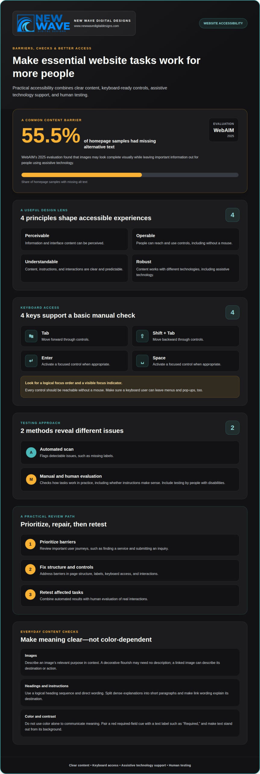
Screen readers can present image alternatives as speech or braille, helping readers understand information otherwise conveyed visually. WebAIM’s 2025 evaluation detected missing alternative text on 55.5% of homepage samples. That finding points to a common accessibility barrier: images can appear complete to sighted visitors while leaving essential information out of the experience.
Write alternatives that fit the surrounding context. If a chart compares appointment options, summarize its useful message rather than listing every visual detail. If an image links to a service page, describe the destination or action. Avoid labels such as “image” or “picture,” which don’t explain what the content adds.
Headings and Page Structure
Headings outline a page, separating its main subject from supporting topics. A clear hierarchy helps readers scan visually and helps assistive tools communicate sections. For example, a page about appointments might have a main heading, followed by separate headings for booking, preparation, and changes.
Use heading levels in a logical sequence, rather than choosing them only for visual size. Heading levels that jump around without reflecting the content can make the page outline harder to follow. Semantic structure also gives organizations a consistent way to present content across pages.
Readable text supports that structure. Prefer a direct instruction such as “Choose a delivery date” over an abstract label such as “Delivery preferences.” Define unfamiliar terms when they first appear, split dense explanations into short paragraphs, and use link wording that explains its destination. These steps help readers understand what to do without interpreting vague labels.
Color should reinforce meaning, not carry it alone. A form that marks required fields only in red may hide that instruction from someone who perceives color differently. Add a text label such as “Required,” and make sure text stands out clearly from its background. This supports readers who need stronger contrast and keeps instructions clear when color perception varies.
Review the page as a connected outline: check that each image has a useful alternative, headings describe the content below them, and instructions don’t rely on color alone. These elements create a more coherent path through information, whether readers scan visually, listen to a screen reader, or use another way to access it.
What makes a website accessible?
A website is more accessible when people can complete tasks using different input methods. Keyboard access, assistive technology support, clear focus indicators, and reliable testing all contribute.
Keyboard Navigation and Support
Keyboard accessibility means visitors can reach and use every control without a mouse. Pressing Tab should move through links, buttons, and form fields, while Enter or Space activates a focused control when appropriate.
This matters for people who navigate with a keyboard, switch device, or screen reader. For example, a business’s booking form should let someone reach each field, choose an option, submit the form, and understand the response using keyboard input. A visible focus indicator shows which control is active, and adequate contrast makes it easier to see.
Screen readers announce a page’s controls and labels, but the controls must still work by keyboard. A button that looks interactive but can’t receive keyboard focus blocks the task, even if its label is announced correctly.
Logical Tab Order and Keyboard Traps
A logical tab order moves focus through a page in the sequence its content is intended to be used. A keyboard trap occurs when someone enters an element but can’t leave it using the keyboard.
For example, a visitor should be able to move from a site menu to the main content, then through its links and form fields. A pop-up can keep focus inside while open, but it must have a keyboard-accessible way to close it. Clean, semantic code usually creates a useful order without manually assigning tab positions.
Accessibility Testing Methods
Automated tools scan pages for detectable issues, while manual testing checks how people experience tasks. Both methods matter: a scan can flag missing labels, but it can’t determine whether instructions make sense.
To test a site, run an automated scan, then use Tab, Shift+Tab, Enter, and Space to navigate key pages. Test forms and menus with a screen reader, and include testing by people with disabilities. For an existing site, prioritize barriers, fix the structure and controls, then retest affected tasks.
Accessibility Audits and Remediation
An accessibility audit identifies barriers, while remediation changes the site to address them. In the United States, audit and remediation costs depend on the site’s size, platform, complexity, and the number and severity of issues. Pricing is provided after a quote request.
A useful review examines important user journeys, such as finding a service and submitting an inquiry. Automated results can guide the review, but human evaluation is needed to assess real interactions. Since content and updates can introduce new barriers, ongoing website support can help maintain accessible functionality as a site changes.
Web Content Accessibility Guidelines (WCAG)
The Web Content Accessibility Guidelines provide a shared framework for designing and evaluating accessible web content. Their principles help shape how people perceive, operate, understand, and use websites across different technologies.
WCAG Conformance Levels
WCAG conformance levels group accessibility criteria according to the requirements a site meets. Level A covers foundational criteria, Level AA adds broader requirements, and Level AAA sets the most demanding level.
For most businesses, WCAG 2.2 Level AA is the general target for accessible websites. WCAG itself is a set of guidelines, not a law; legal duties depend on the situation. The World Wide Web Consortium published WCAG 2.2 in October 2023, and the Web Accessibility Initiative identifies it as an international standard and an ISO standard. Applying this framework gives website accessibility for disabled users a practical design direction.
The guidelines are organized around four principles: content should be perceivable, operable, understandable, and robust. An online appointment process, for example, needs information people can access, controls they can use, instructions they can follow, and functionality compatible with assistive technology.
Accessible Content and Communication
Accessible communication presents information in ways people can perceive and understand, rather than relying on one sensory channel or dense wording. A video announcement, for example, should include captions and a transcript so people who are deaf or hard of hearing can access its information.
Use direct instructions and explain actions clearly. A form can say “Enter your email address” instead of relying on an unexplained abbreviation. Consistent navigation and predictable page elements also help people understand where they are and what will happen next.
Readable text and sufficient contrast support visual access for different viewing needs. These choices are part of website accessibility for disabled users, and they can also make information easier to follow on different devices and screens.
Alternative Text for Non-Text Content
Alternative text gives assistive technology a text equivalent for meaningful non-text content, such as an informative graphic. It allows readers who can’t perceive the visual to access the information it communicates.
Describe the purpose, not every visual detail. For a diagram explaining how a service works, convey the essential relationship or process. For a decorative shape that adds no information, avoid a redundant description. Choose the alternative according to the graphic’s role in the surrounding content.
Flashing and Moving Content Controls
Flashing content can create a seizure risk, so web pages should not contain elements that flash more than three times during any one-second period. Avoid rapid visual effects, especially when they serve no essential purpose.
Moving content needs user controls. A rotating announcement or animation should have a way to pause or stop it, so readers can manage its pace. For time limits, provide a way to turn them off before they begin or extend the available time. These controls make website accessibility for disabled users more responsive to different needs and ways of engaging.
Common digital barriers and complex layouts
Accessibility barriers arise when a page’s design or behavior prevents someone from completing a task. They can affect people with different disabilities, devices, and ways of navigating.
Recognizing common barriers helps organizations focus on where a user’s journey breaks down, from finding information to completing a form.
Examples of Website Accessibility Barriers
Website accessibility barriers are design or content choices that make information or tasks difficult to use. WebAIM’s 2025 evaluation of 1,000,000 website homepages detected low-contrast text on 79.1% of samples and missing form input labels on 48.2%.
The same evaluation detected empty links on 45.4% of homepages and empty buttons on 29.6%, according to WebAIM. A screen reader may announce an unlabeled button without explaining its purpose, leaving a visitor unsure whether it submits a form or opens a menu. Missing document language, detected on 15.8% of samples, can also affect how assistive technology interprets text.
WebAIM found that six common categories accounted for 96% of detected errors in its 2025 report. This points to practical places to examine: text contrast, form labels, link and button names, image alternatives, and page language. An empty link in a navigation section, for example, can interrupt the route to essential information.
Disabilities and Access Barriers
Access barriers occur when a website’s design conflicts with how someone perceives, understands, or interacts with content. Web accessibility includes auditory, cognitive, neurological, physical, speech, and visual disabilities.
A visitor with limited dexterity may struggle with a small click target, while someone with low vision may have difficulty distinguishing low-contrast text. A person with a cognitive disability may lose their place on a dense page with unclear section labels. The same design decision can create different obstacles for different people.
People also encounter barriers in changing contexts. Someone using a phone in bright light may need stronger visual contrast; someone with a temporary injury may rely on keyboard navigation. Designing for varied access needs helps prevent one interaction style from determining who can use a service.
Barriers in Complex Layouts
Complex layouts become barriers when visual placement and interaction order don’t give users a coherent path. A page with multiple columns, pop-ups, and nested menus can make it harder to find the main content or follow the intended sequence.
For example, a screen reader may encounter a sidebar before the primary article, even when the visual design emphasizes the article. On a smaller device, a crowded menu can obscure navigation controls or require excessive scrolling. Clear regions, consistent navigation, and a predictable reading order help users move through these layouts.
Review complex pages by following a real task, such as finding a service and submitting an inquiry. Check whether repeated elements are consistent, controls are easy to distinguish, and content stays understandable when enlarged. These checks connect accessibility principles to the details that shape a person’s experience across devices.
Designing websites for people with physical disabilities
Physical disabilities can affect how someone points, presses, or moves through a page. A visitor with limited hand control, for example, may use a keyboard or switch device instead of a mouse. Good design makes essential tasks available through different methods, without requiring precise movements or fast reactions. That’s a practical foundation for website accessibility for disabled users.
Start with the task, not the input device. On a service page, someone should be able to open navigation, choose a link, and reach the contact form using keyboard controls. Keep focus visible and predictable, and make sure menus and dialogs don’t trap visitors. These practices support people using keyboards, switches, or voice input.
Consider the physical effort each interaction requires. Closely spaced links can be difficult to select on a phone, especially for someone with tremors or limited dexterity. Give controls clear labels and enough separation to distinguish actions. Avoid requiring dragging when a button or selection can do the same job.
Mobile design needs care because touch is a primary interaction. A small menu icon may be hard to activate, while a control placed beside another can lead to accidental selections. Use clear labels where helpful, and keep important actions easy to find as the screen changes size.
Forms should support deliberate, recoverable input. Someone completing an appointment request may need to correct a date without losing earlier answers. Label each field, explain errors beside the relevant input, and preserve entered information when validation fails. This reduces unnecessary effort and supports website accessibility for disabled users.
Time-sensitive interactions can exclude people who need longer to position a pointer or enter information. If a booking flow has a time limit, explain it and provide a way to extend the session. Test the journey from opening the form through confirmation using keyboard navigation and assistive input methods.
Testing should reflect real tasks, not just a visual review. Try a mobile device, keyboard-only navigation, and input methods used by people with physical disabilities. Check whether each control can be reached, activated, and corrected without unnecessary precision. Plan an accessible website design around those interactions from the earliest layout decisions.
New Wave Digital Designs
New Wave Digital Designs can turn accessibility principles into thoughtful website design and ongoing care. If keyboard navigation, page structure, or interactive controls need attention, web design can shape a clearer experience around how people use the site. Website maintenance and support can help keep accessibility in mind as content and features change.
Turn to the team when accessibility concerns affect important journeys, such as finding information or completing a form. The next step is a conversation about your site, its users, and the barriers you want to address. Contact New Wave Digital Designs to discuss your website.
Make accessibility part of what comes next
Accessibility isn’t a finish line. It’s a design commitment that continues as a website evolves, new content appears, and user needs inform the next decisions. Treat each update as an opportunity to preserve an experience that works for more people.
New Wave Digital Designs supports this ongoing work through website maintenance and website support, alongside AI Agents. The focus is on keeping your digital experience aligned with your goals while making thoughtful improvements to website accessibility for disabled users.
Choose a next step that fits your site, whether that means refining an existing experience or planning a new direction. Contact New Wave Digital Designs to discuss how to move forward. A more accessible website is built through considered choices, and each one can make the path clearer.
Frequently Asked Questions
How Do People with Disabilities Access the Web?
People use a mix of assistive technology, input methods, and display settings to access websites. Someone may listen to screen-reader output, navigate with a keyboard, use touch gestures, or enlarge text. For example, a person with limited dexterity might use voice input to fill out a form, while someone who is deaf may read captions. Accessible pages let people choose the method that works for them.
What website accessibility standards apply in the United States, including WCAG 2.2 and ADA requirements?
WCAG 2.2 is an international accessibility standard, while the ADA is a separate nondiscrimination law. The ADA applies to state and local government services under Title II and businesses open to the public under Title III. Section 508 addresses access to federal information and communication technology. The applicable requirements depend on the organization and context, so WCAG offers a practical design framework, not a replacement for legal obligations.
Which disabilities and user needs should accessible websites accommodate?
Accessible websites should account for auditory, cognitive, neurological, physical, speech, and visual disabilities. Needs can vary within each group. A visitor with low vision might enlarge text, while someone with a cognitive disability may benefit from concise instructions and predictable steps. A person with limited mobility may use voice controls or a keyboard. Designing for this variety helps people access information and complete tasks in different ways.
What are the key website accessibility requirements for keyboard navigation, screen readers, color contrast, and captions?
Make core tasks usable by keyboard, ensure screen readers can identify controls, provide distinguishable text and background colors, and caption spoken video content. In a checkout flow, for example, a keyboard user must reach each field and submit the order, while a screen reader user needs meaningful control names. Captions should convey spoken information, not merely indicate that sound is playing. Test complete tasks, not isolated page elements.
What are the legal risks and penalties for inaccessible websites under the ADA?
An inaccessible website can expose an organization to an ADA discrimination claim, and disputes may lead to litigation or negotiated changes. There is no single penalty amount for every website issue; outcomes depend on the facts and applicable law. Businesses should treat access as part of ongoing digital operations, address barriers as they arise, and seek qualified legal guidance about their specific obligations.
What accessibility features should be included when designing and developing a new website?
Plan accessibility into a site’s foundations: semantic page structure, clear control names, keyboard-operable interactions, readable text, and forms that explain errors. For example, a registration form should identify required fields and point users to an error without erasing valid entries. Include captions for video and alternatives for informative graphics. Build and test these features across the site’s main user journeys, rather than adding them as a final visual layer.
How can businesses maintain website accessibility as content and software change?
Make accessibility review part of the publishing and update process. When a business adds a form, video, or page template, assess the new component and test the user journey it affects. Software updates can change menus or form behavior, so retest key interactions after significant changes. For organizations in New Jersey, including Somerset, Hunterdon, and Morris counties, ongoing maintenance and support can help keep accessibility in view as websites evolve.