Visual polish isn’t proof of accessibility. The ADA doesn’t specify a technical website standard for private businesses, but WCAG 2.1 Level AA is a practical benchmark for reviewing accessibility. An “Is my website ADA compliant?” checklist for 2026 should examine whether people can access your content, navigate your pages, and use your interactive features.
It’s understandable to wonder whether a site that looks clear and works well for you will work for everyone. Accessibility also depends on details that can be easy to miss, from keyboard navigation and color contrast to image descriptions and form instructions. This guide will help you review those essentials and understand what your findings can tell you.
Work through content, navigation, contrast, and mobile use, then consider how to keep accessibility in view over time. Websites change as content and features are added, so staff awareness and ongoing maintenance matter alongside an initial review.
Key Takeaways
- Use WCAG 2.1 Level AA as a practical reference point when reviewing website accessibility, while understanding how ADA requirements differ by organization.
- Check that meaningful images have useful alternative text and that video and audio content can be accessed through captions or transcripts.
- Review text contrast and make sure color isn’t the only way your site communicates meaning, status, or instructions.
- Use clear heading structure, descriptive links, and keyboard-friendly navigation to help visitors move through pages and find information.
- Build accessibility into staff routines and website maintenance so new content and changes don’t introduce barriers.
What Is WCAG 2.1 Level AA?
WCAG means the Web Content Accessibility Guidelines, a technical framework for making digital content accessible. It sets testable criteria for websites, videos, sound, and documents. Its conformance levels are A, AA, and AAA. Level A addresses foundational barriers; Level AA adds broader access requirements; AAA sets more demanding criteria. WCAG is not itself a law, but it gives teams specific standards to apply. The question behind an “is my website ADA compliant checklist 2026” review is how well visitors can access and use your content.
For state and local governments, what is the DOJ’s 2026 web accessibility compliance deadline? The U.S. Department of Justice’s Title II rule sets WCAG 2.1 Level AA as the minimum technical standard, but deadlines depend on the public entity. Special district governments must comply by April 26, 2028.
Which WCAG version and conformance level should a website meet for ADA compliance? WCAG 2.1 Level AA is a practical benchmark, and it is the standard named in the DOJ’s Title II rule. The Federal Register published the Department of Justice’s final rule updating its Title II ADA regulations on April 24, 2024. Use that distinction when applying an “is my website ADA compliant checklist 2026” review to your own organization.
How do website ADA requirements differ by state or for government contractors? The DOJ’s Title II rule applies directly to state and local government entities, not to contractors as a category. Identify the public entity and review the project agreement and applicable requirements to define a contractor’s accessibility responsibilities.
Level A criteria form a foundation for meaningful access. Check that visitors can navigate by keyboard, headings describe page structure, and the page language is identified in code. For example, visitors should be able to move through a menu without a mouse. Video with spoken information also needs an accessible text alternative. These checks help establish whether people can reach and understand core content and controls.
- Navigation: Test menus, links, and controls using a keyboard alone, including a visible focus indicator.
- Headings and language: Use meaningful heading structure and identify the page language in code.
- Media: Provide captions for video and text alternatives for audio information.
Level AA adds practical requirements for contrast, resizing, and mobile display. Standard text needs a contrast ratio of at least 4.5:1; large text needs at least 3:1. Text must resize up to 200% without losing content, functionality, or context. Pages must reflow at 320 CSS pixels without information loss, functionality loss, or horizontal scrolling. Check each condition on real pages, not just design mockups.
How much does an ADA website accessibility audit and remediation cost in 2026? Test your site with automated scans and manual keyboard and screen-reader checks. Scanners commonly miss context-dependent alt text, unclear link labels, and form errors that users cannot understand or correct. Review those interactions directly.
What are the risks, lawsuits, and penalties for an inaccessible website? The ADA can expose businesses to legal claims, and reported civil penalties can reach $75,000 for a first violation and $150,000 for subsequent violations. Treat accessibility as a continuing practice: document testing, fixes, and maintenance rather than relying on a one-time scan.
Image alt text, video captions, and transcripts
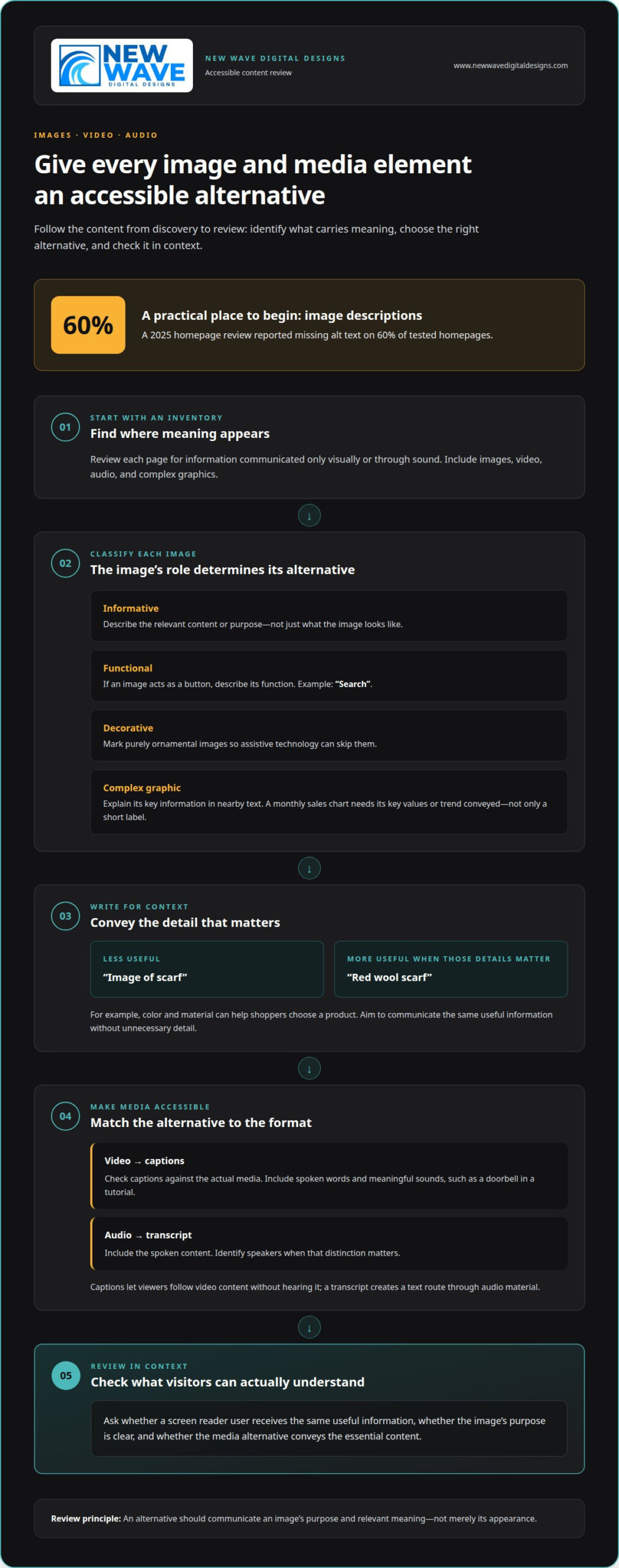
Images and media can convey essential meaning, but that meaning needs a text alternative. Review each page for information conveyed only visually or through sound. Accessibility guidelines call for alternatives that communicate an image’s purpose, not just its appearance. On a product page, for example, “red wool scarf” is more useful than “image of scarf” when color and material help shoppers choose.
Start with a focused inventory. For every image, decide whether it informs, labels, or decorates the page. Then check the alternative text in context: a screen reader user should get the same useful information, without hearing a string of unnecessary details. A 2025 homepage review reported missing alt text on 60% of tested homepages, making image descriptions a practical place to begin.
- Describe informative images precisely: Write alt text that conveys the image’s relevant content, such as “Two oak chairs beside a round dining table.” This gives visitors with disabilities information otherwise communicated visually.
- Give functional images an action-based alternative: If an image acts as a button, describe its function, such as “Search,” rather than its shape or color.
- Keep decorative images out of the reading flow: Mark purely ornamental images so assistive technology can skip them. A decorative divider should not be announced as meaningful content.
- Check complex graphics for complete information: A chart showing monthly sales needs its key values or trend explained in nearby text. A short label alone may not convey the data.
- Review captions against the actual media: Captions should include spoken words and meaningful sounds, such as a doorbell in a tutorial. Accurate captions let viewers follow the content without hearing it.
- Provide transcripts for audio: A podcast transcript should include the spoken content and identify speakers when that distinction matters. This creates a text route through the same material.
Captions and transcripts serve related but different purposes. Captions appear with video so viewers can follow speech and relevant sounds as they happen. A transcript presents spoken material as readable text, which can help people who prefer reading or cannot access audio. For a recorded product demonstration, review the captions while watching and compare the transcript with the narration before publishing.
Automated checks can flag images missing alternative text, but they cannot reliably judge whether a description is accurate or useful. Review each image alongside its surrounding copy. Ask whether the alternative adds needed information or repeats nearby words. Check captions for timing, clear speaker identification, and meaningful sounds. This editorial review can reduce barriers across a website instead of treating accessibility as a field to fill in automatically.
Color contrast and color-independent cues
Color can clarify a page, but it shouldn’t be the only way to convey meaning. A red error message, for example, may be difficult to identify for visitors with color-vision disabilities. Pair color with a written label, icon, or border so the message remains clear. This applies to public information, federal forms, and commercial pages alike.
Review each interactive element against its background. Use a contrast checker to assess text, button labels, form borders, and focus indicators. Then inspect the live page, because images, gradients, transparency, and hover states can affect how colors appear. A button that looks distinct in a design file may be hard to see over a photograph.
- Check text in its final placement: Test headings, body copy, and small labels against the surface behind them. Contrast needs to remain clear in banners and image overlays, not only plain text sections.
- Pair color with another signal: Mark required fields with text, not color alone. A form can say “Required” beside the field instead of relying on a red outline.
- Make links recognizable: Underlining links helps distinguish them from surrounding copy. Color can reinforce that cue, but shouldn’t be the only difference.
- Show status with words or shapes: A chart should label each series or use distinct patterns. A legend that distinguishes categories only by color can hide meaning.
- Test keyboard navigation: Move through controls with the keyboard and confirm the focus indicator stands out. A visible focus state helps users track their position.
Give responsive layouts a separate visual review. At a narrow viewport, check that text, controls, and status messages remain visible without overlapping. A desktop color treatment may disappear when a layout stacks or a background image shifts. Resize the browser, inspect a mobile screen, and repeat the contrast check on the rearranged design.
For government entities covered by the DOJ’s Title II rule, accessible presentation supports equal access to public services. The same design habits help other organizations communicate clearly across devices. Check charts, alerts, navigation states, and form feedback, not just paragraphs. A subtle border can identify a selected tab, while a text label can clarify which option is active.
Record each issue with its page, element, and correction. For example, note that a pale button label becomes difficult to read over its background, then adjust the text or surface and retest. Keep the visual identity intact while making meaning legible. Thoughtful graphic design can help align a distinctive palette with clear, usable cues.
Semantic headings, links, and skip navigation
Page structure should make sense before visual styling is applied. Use semantic heading elements in a logical order so screen readers can announce the content hierarchy. Someone scanning a long service page should be able to move between meaningful headings rather than a sequence of styled paragraphs. Check each page’s outline and confirm that headings describe the sections beneath them.
Descriptive links help people choose the right destination. Replace vague labels such as “click here” with specific wording, like “Read our return policy.” Underlined text should function as a link, and repeated links to the same destination can be consolidated when they add no value. These choices help keyboard and screen-reader users understand what each control does.
- Check heading order: Use headings to organize sections, not merely to change font size. A clear sequence helps visitors scan the page and understand how topics relate.
- Make each link descriptive: Confirm its label identifies the destination or action. “View appointment options” conveys more than “Learn more.”
- Provide a skip link: Add a keyboard-accessible link near the top that moves focus past repeated navigation to the main content. It gives returning visitors a quicker route through the page.
- Test every control without a mouse: Use Tab, Shift+Tab, Enter, and arrow keys where appropriate. Menus, forms, and dialogs should remain operable through keyboard navigation.
- Keep focus visible: Move through the page and watch for a clear focus indicator around links and controls. Without it, keyboard users can lose their place on screen.
- Manage focus after changes: Open a menu or dialog, then confirm focus moves into it and returns sensibly when it closes. This keeps the user oriented after an interface change.
Test complete user journeys, not just individual buttons. For example, navigate from a homepage to a contact form, complete its fields, and submit it using only a keyboard. Confirm that focus follows a logical path and any error message can be reached. A control that responds to a mouse but not a keyboard blocks the task.
These checks matter across platforms, including desktop browsers and mobile devices with external keyboards. Title II of the ADA requires state and local government entities to make their services, programs, and activities accessible to people with disabilities. On public pages, a consistent heading structure, descriptive link text, and working skip navigation help visitors find information and complete tasks. Record the page and interaction that failed, then retest the repaired path.
Staff training and ongoing maintenance
Accessibility can change whenever staff publish content, modify a template, or add a feature. A new image, form, or document can introduce barriers even after an earlier review. Under the Americans with Disabilities Act, accessible digital experiences depend on the site people use today, not only its original design. Include accessibility in routine publishing and technical maintenance.
How should you prioritize and document website accessibility fixes? Start with barriers that stop visitors from completing essential tasks, such as finding service information or submitting a form. Record the page, affected element, user impact, assigned fix, and retest result for each issue.
- Assign clear ownership: Identify who reviews page content, approves design changes, and handles technical fixes. A named owner helps prevent an accessibility issue from disappearing between teams.
- Train content editors: Include practical examples in onboarding, such as writing meaningful image descriptions and using headings to structure an announcement. Editors shape the experience every time they publish.
- Review templates before rollout: Test a changed page layout with real content before applying it across the site. A template change can affect menus, forms, and repeated page components.
- Include accessibility in publishing: Add a review step for new pages, documents, and media. For example, check captions and text alternatives before a recorded presentation goes live.
- Retest after fixes: Revisit the affected task after a correction, then check related pages that share the same component. This confirms the change works in context.
Build a maintenance routine around meaningful changes. Review the site when teams add a feature, replace a theme, revise navigation, or publish a new document library. These changes can alter the underlying structure or introduce content assistive technology cannot interpret. A screen reader test can reveal a missing label or confusing announcement that a visual review may miss.
Make accessibility training specific to each role. Designers need to understand how color choices affect clarity; writers need to structure content and describe images; developers need to preserve accessible behavior in interactive components. Give each role concise processes and examples that match its daily work. Refresh the guidance when publishing tools or digital workflows change.
Keep an issue log with dates, findings, decisions, completed fixes, and retest notes. If you receive an ADA demand letter, documented testing, fixes, and ongoing accessibility maintenance can help show active compliance efforts. The record also helps teams identify recurring issues, such as form-label errors, and fix their cause rather than patching pages one at a time.
For a site that needs continuing technical updates, plan ongoing website maintenance as part of its accessibility practice.
New Wave Digital Designs: Shopify Website Design
New Wave Digital Designs creates and maintains websites through Shopify Website Design, WordPress Website Design, SquareSpace Website Design, and Website Maintenance. If your accessibility review identifies issues with page structure, navigation, or content workflows, a design or maintenance project can offer a practical next step.
For a new Shopify site, accessibility considerations can inform the structure and content from the start. For an existing website, maintenance supports ongoing updates as pages and features evolve. The right approach depends on your platform and the improvements you’ve identified.
Bring your accessibility priorities to your next website design or maintenance project. Visit www.newwavedigitaldesigns.com to contact New Wave Digital Designs.
Make Accessibility Part of What Comes Next
Let your accessibility review shape the way your website evolves. A 2026 checklist for asking, “Is my website ADA compliant?” can be more than a one-time review; use it to guide decisions as pages, content, and site features change. That shift makes accessibility part of the design process, rather than a repair saved for later.
Choose a practical next step: identify the most important issue in your review, assign responsibility for addressing it, and plan how to maintain the improvement. If your findings point to design changes or ongoing website work, New Wave Digital Designs can help you move forward with care and clarity.
Contact New Wave Digital Designs to discuss your website goals. Each thoughtful improvement can make your digital experience more welcoming and easier to use.
Frequently Asked Questions
What Is ADA Website Compliance?
ADA website compliance means making online services accessible to people with disabilities under applicable ADA obligations. Specific legal requirements depend on the organization and the service involved. For a practical review, consider whether visitors can complete essential tasks, such as finding business hours, registering for an event, or making a purchase. WCAG provides technical criteria for examining barriers, but it is a guideline framework, not the ADA itself.
Does ADA Apply to Websites?
ADA requirements can apply to websites, but the rules depend on who operates the site. The Department of Justice’s Title II web accessibility rule applies directly to state and local government entities. For private businesses, Title III covers places of public accommodation, and courts have ruled that websites can qualify. A website’s role in providing services or access is central to understanding the issue.
Does this apply to private nonprofits?
The DOJ’s Title II web rule does not apply directly to private nonprofits as a category because it covers state and local government entities. That distinction does not automatically resolve every nonprofit’s ADA responsibilities. Title III applies to places of public accommodation, and courts have ruled that websites qualify. Nonprofits should consider their activities and how their websites support access to services, events, or other public-facing offerings.
Is using an accessibility overlay or widget enough to be ADA-compliant?
No. An accessibility overlay or widget alone does not make a website ADA compliant. A tool may add controls, but it cannot reliably correct every barrier in page structure, content, forms, or interactive features. For example, a widget cannot determine whether an image description accurately explains a product or whether a checkout process works with assistive technology. Review the underlying website experience and test real user journeys.
Is it important to follow ADA guidelines when designing your website?
Yes. Accessible design helps people with disabilities use information and services in different ways. It also makes usability a deliberate part of decisions about layout, content, and features. For example, consider keyboard access while designing a menu, rather than discovering later that someone cannot open it without a mouse. Treat accessibility as a design requirement throughout publishing and future updates.
What are the ADA Requirements for Websites in 2026?
There isn’t one technical ADA website standard specified for private businesses. WCAG 2.1 Level AA serves as a practical benchmark, while the DOJ’s Title II rule requires it for state and local government websites. Don’t confuse that government rule with a universal private-business deadline. If your organization serves the public, assess its legal context alongside practical accessibility checks for key pages and user tasks.
What are the 2026 ADA requirements for website accessibility in the United States?
In the United States, the DOJ’s Title II web rule applies directly to state and local government entities and sets WCAG 2.1 Level AA as the minimum technical standard. Private businesses don’t have a separate website ADA law or compliance deadline, and Title III doesn’t specify a technical standard. WCAG remains a useful review framework. Identify your organization type first, then evaluate the website’s essential services and interactions.
Does the ADA apply to private business websites and nonprofit websites?
Title III applies to places of public accommodation, and courts have ruled that websites qualify. The ADA does not specify a technical standard for Title III website accessibility. By contrast, the DOJ’s Title II web rule applies to state and local government entities, not private businesses or nonprofits as categories. In either case, consider how the website connects people to services, programs, purchases, or public-facing activities.